The work, at a glance
Each project keeps its own identity, visual language and brand mood. Choose a chapter to enter its world.


Anya Segen · Recent Projects Showcase
Independent engagements across cultures, causes and destinations — each a different problem in perception, solved the same way: strategy first, then identity, story and public-facing execution.
Scroll
Each project keeps its own identity, visual language and brand mood. Choose a chapter to enter its world.
Branding · Chhattisgarh
A cultural branding project giving Chhattisgarh's artistic, craft and heritage ecosystem a distinct identity — beyond decorative representation, into a brand language rooted in local pride, indigenous creativity and contemporary presentation.
State-run craft with priceless heritage — and no brand gravity outside Chhattisgarh.
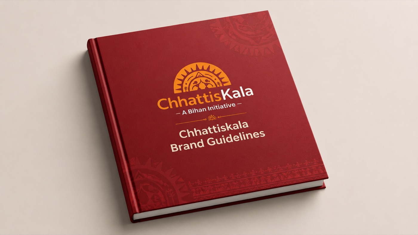
A complete identity system — catalogue, exhibition language, artisan IDs, digital presence — one visual voice.
From welfare initiative to a cultural brand that collectors seek out.

Build a distinct, contemporary cultural identity rooted in local pride, not folk decoration.
Folk influences, regional motifs, craft textures and earthy colour inside a modern visual structure.
Exhibitions, digital platforms, merchandise, signage and communication material.
Not just a showcase of tradition — a living cultural brand and platform for artists, artisans and the creative spirit of Chhattisgarh.

Craft & Culture catalogue
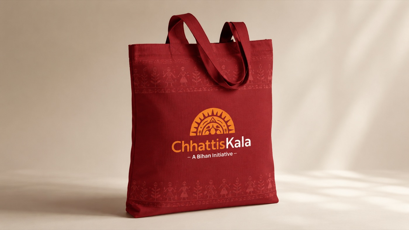
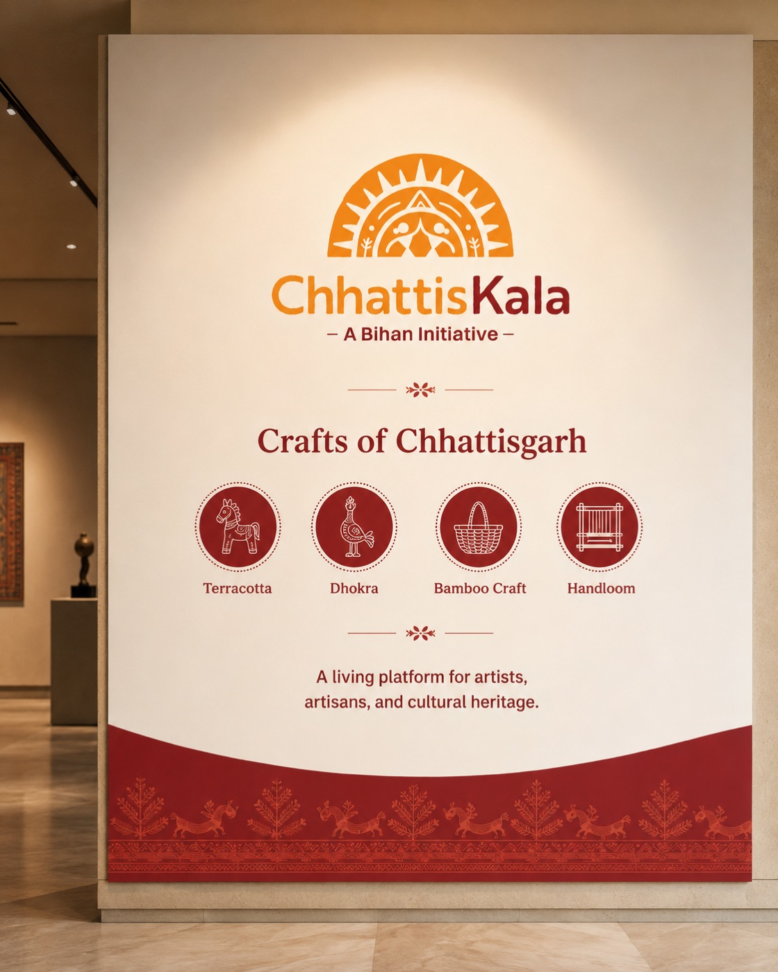
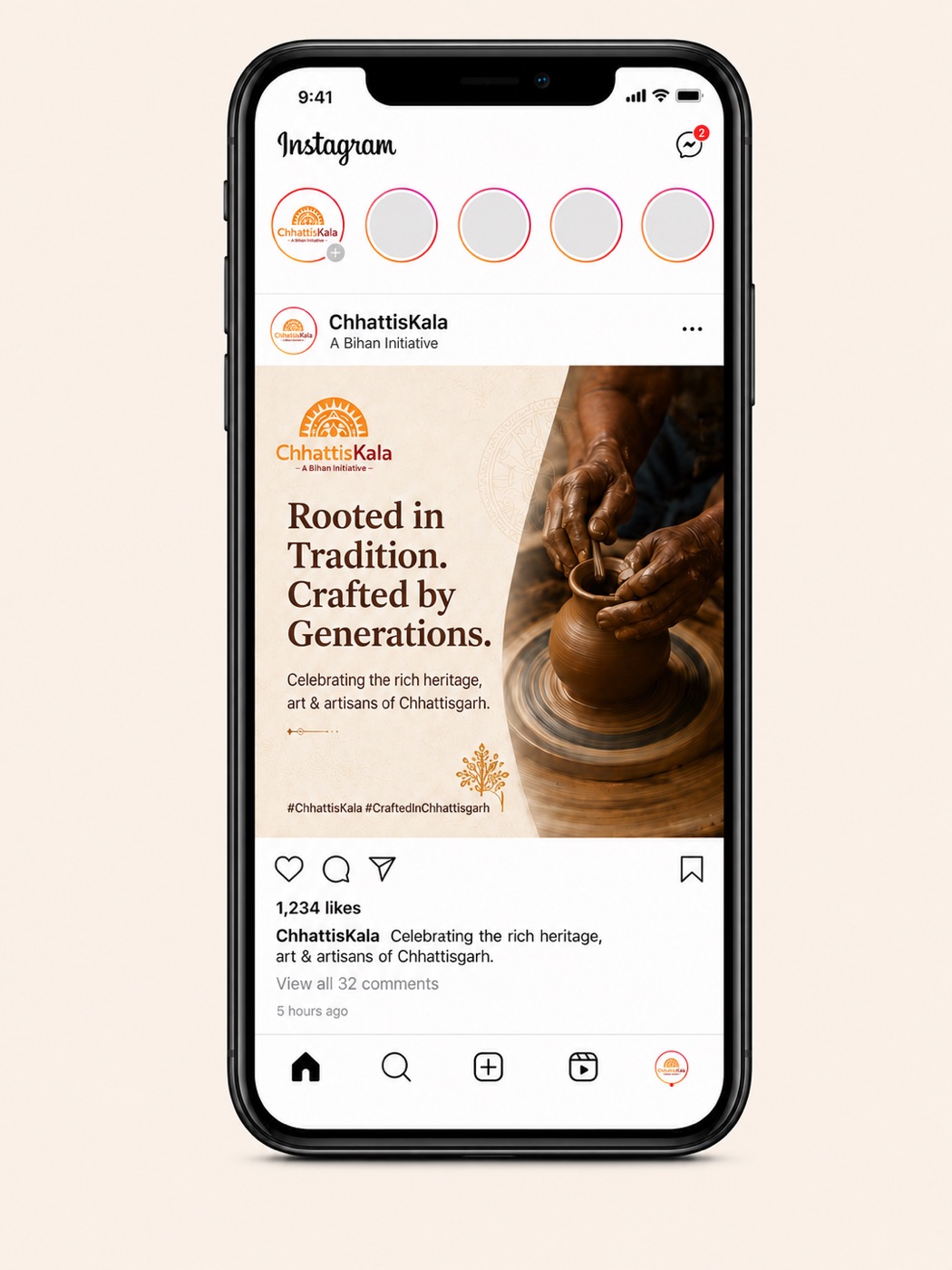

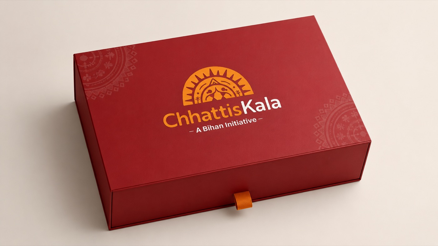
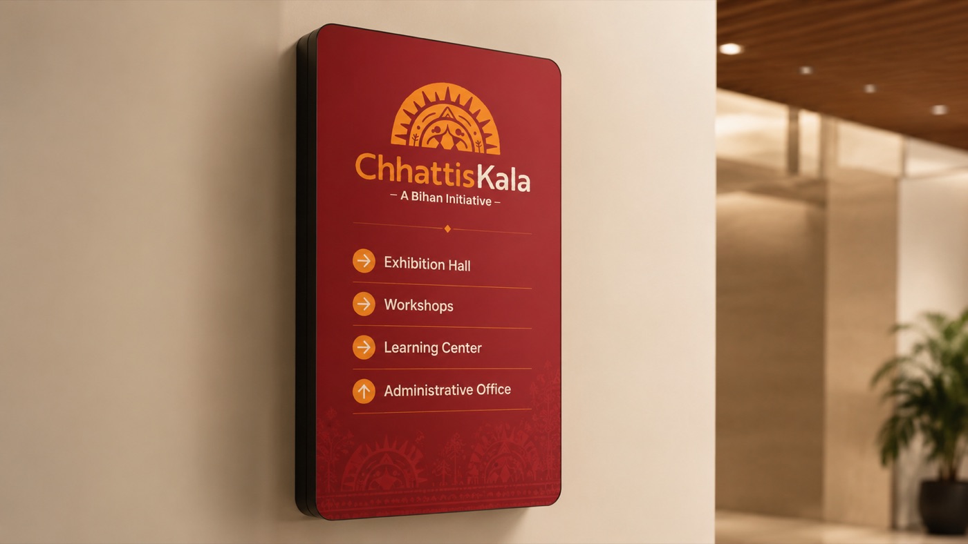
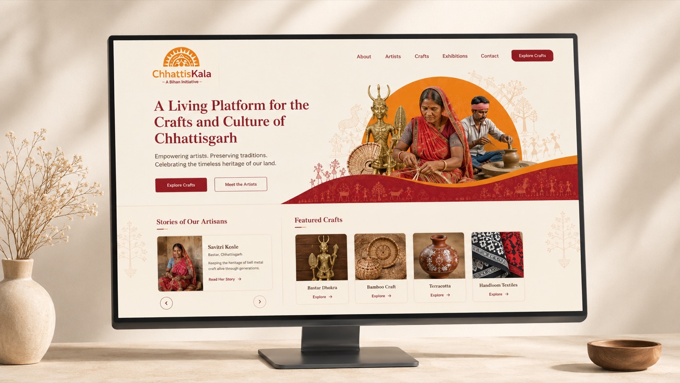
Identity in application: packaging, brochure, exhibition wall, tote bag and wayfinding
The system keeps growing — exhibition, retail, artisan ID and digital, all speaking one visual language. Tap any frame to enlarge.
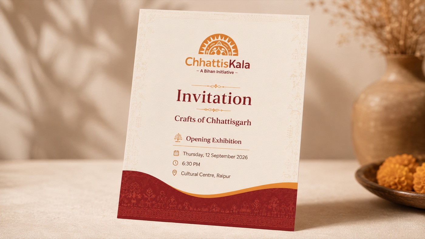
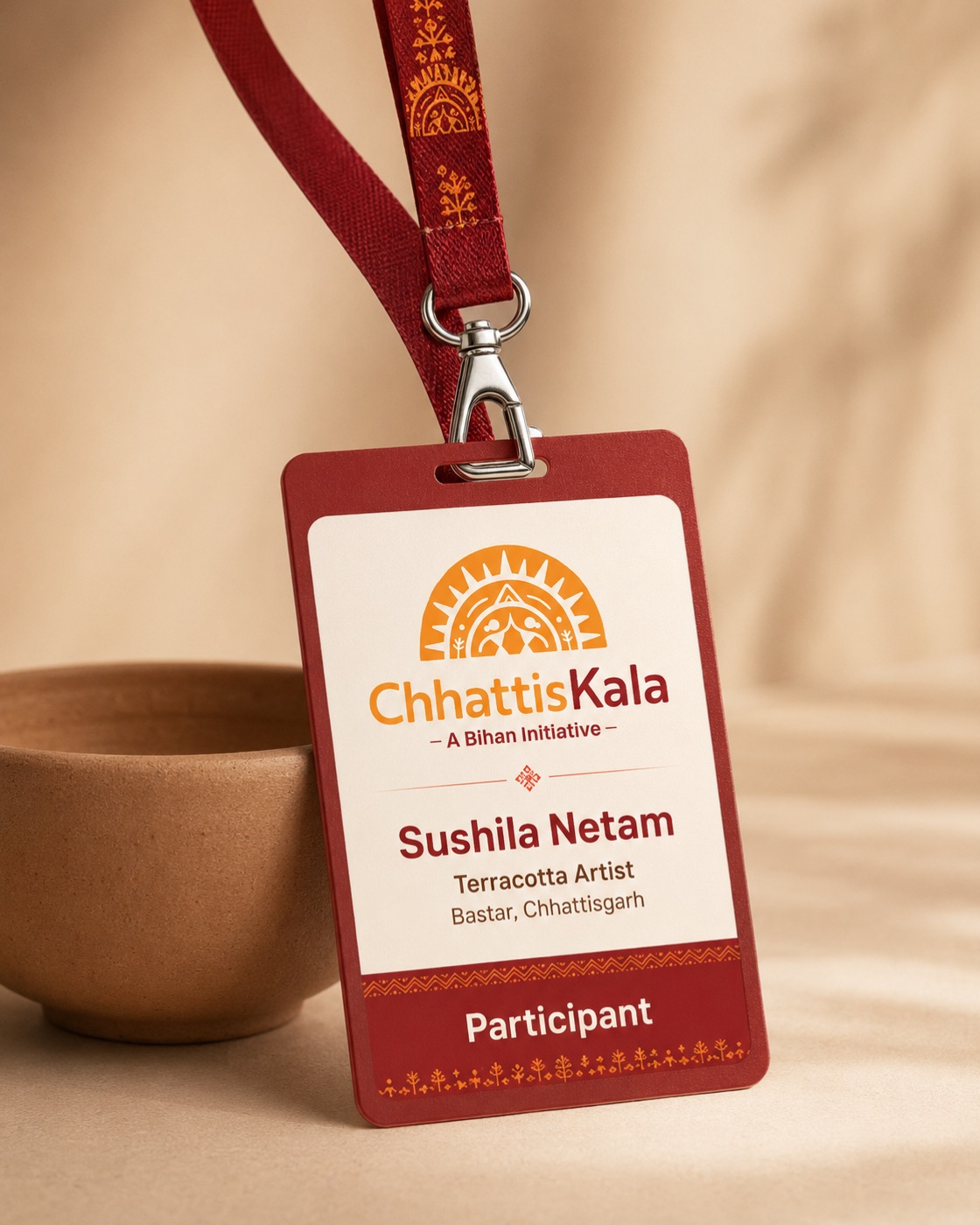
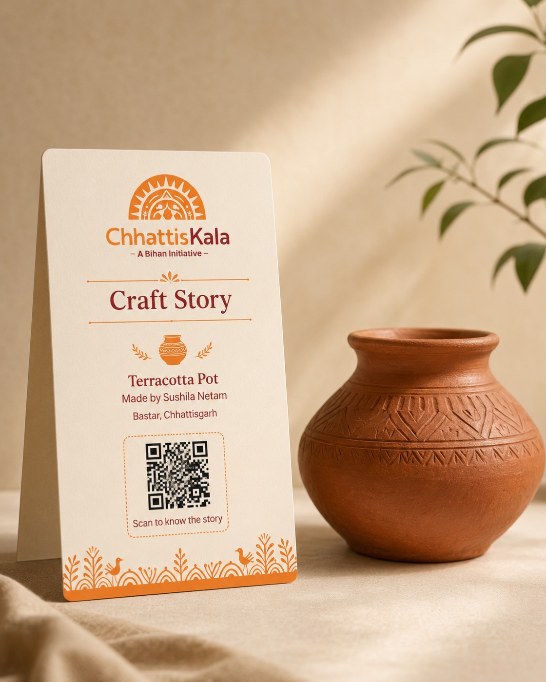
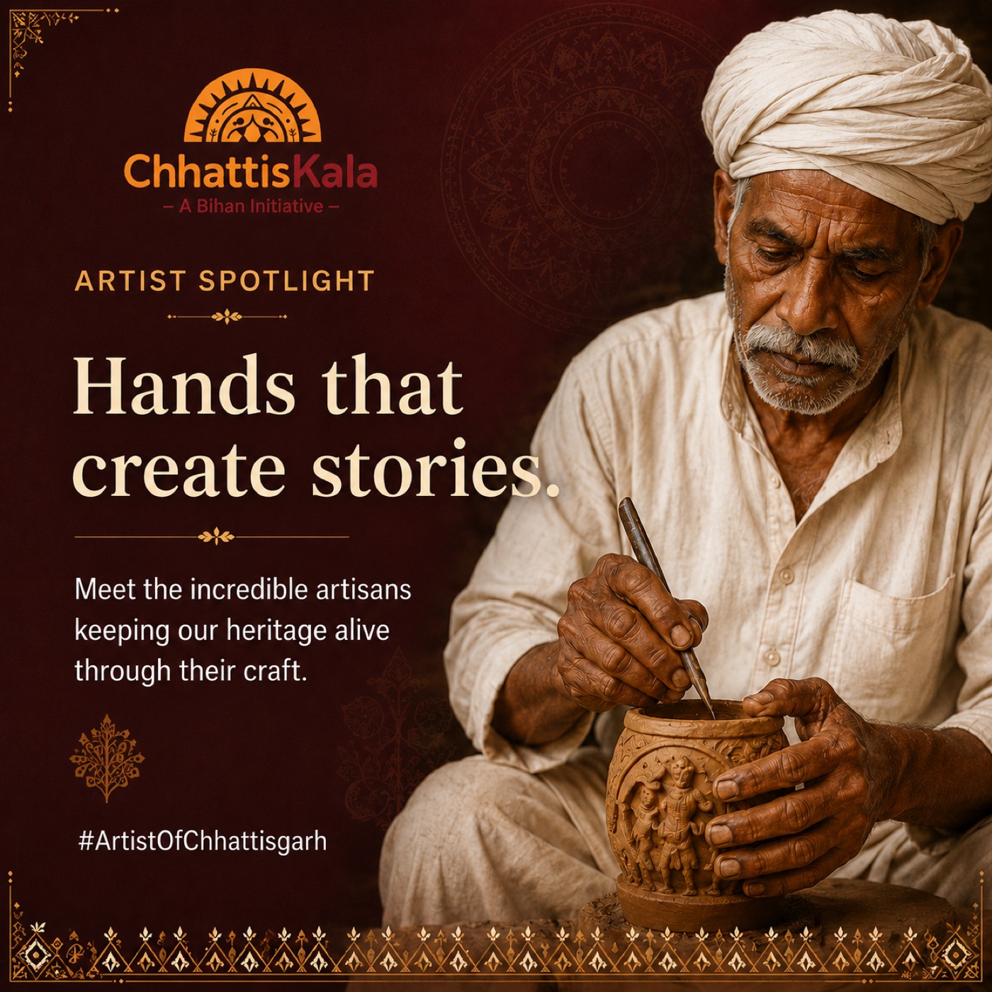
"The value of Chhattiskala was never just visual. It converted culture into a scalable identity system that travels across spaces, screens and public communication."
Strategic insight · 01Identity & Event · Uttarakhand
Identity and event-led initiatives under the Mukhyamantri Udhyamshala Yojana, built on one emotional metaphor everyone already owns: small savings becoming big possibilities.
A household word for savings — invisible as a platform for rural enterprise.
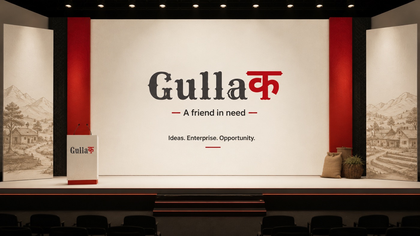
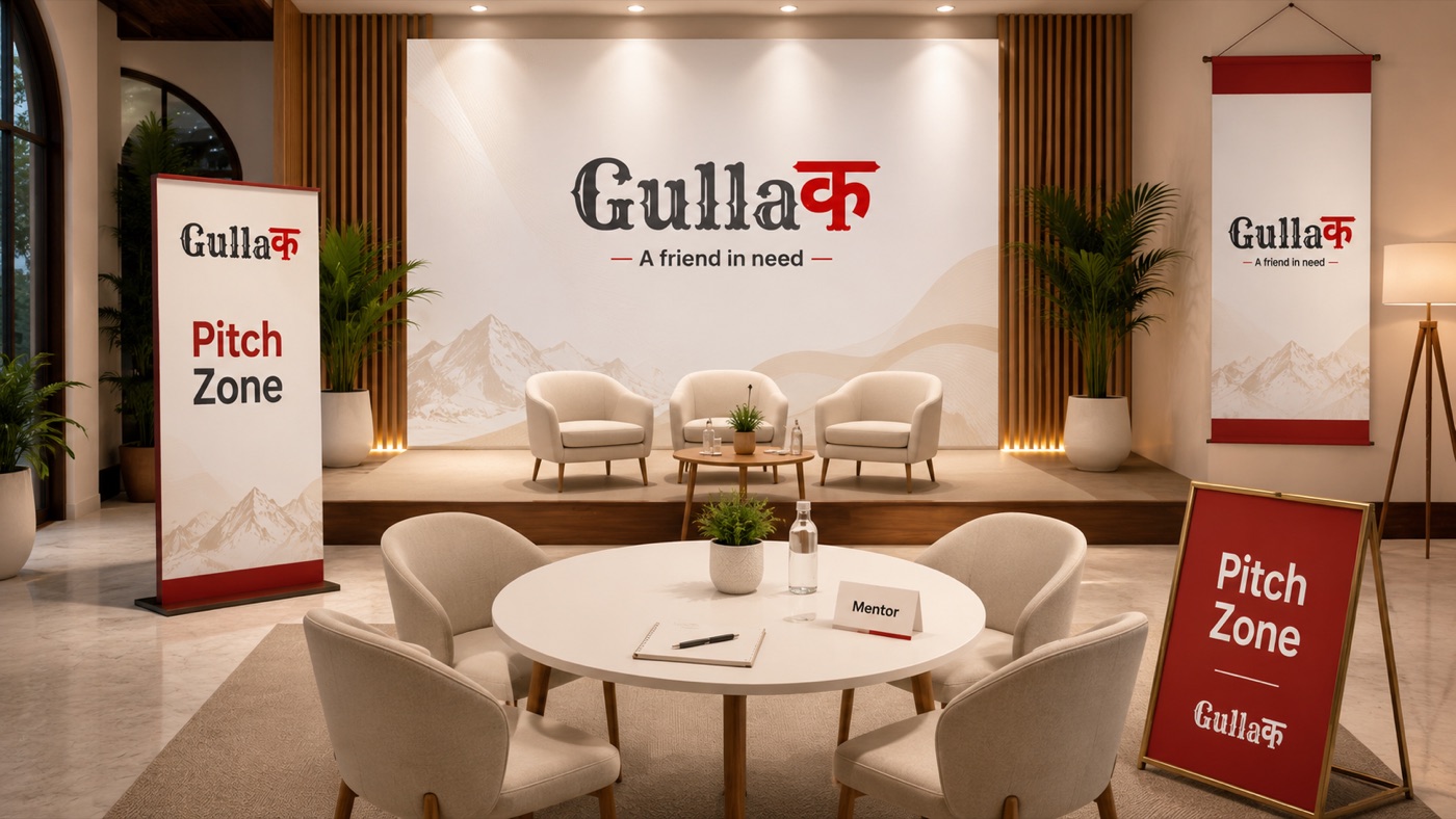
An identity and a summit system: main stage, pitch zone, badges, campaign and social set.
From a nostalgic noun to a stage rural entrepreneurs aspire to stand on.
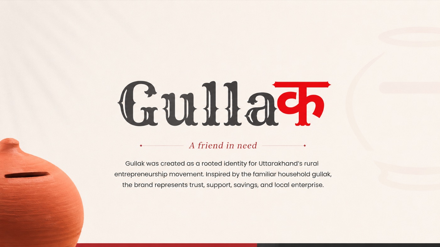
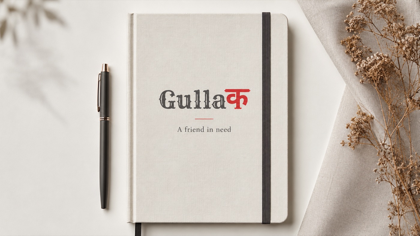
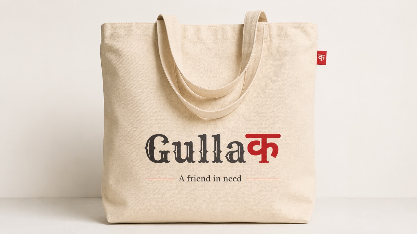
The logo & the idea — money-inspired lettering with the Hindi क, built on the clay gullak everyone grew up with
The household gullak — small savings becoming big possibilities. A symbol of trust everyone grew up with.
Money-inspired lettering with the Hindi क — accessible, youthful, optimistic, rooted in Indian aspiration.
Stage design, event branding and visual systems that turned entrepreneurship into a relatable public experience.
Gullak 2.0 — the same idea, evolved: structured, scalable, built for wider participation and stronger recall.
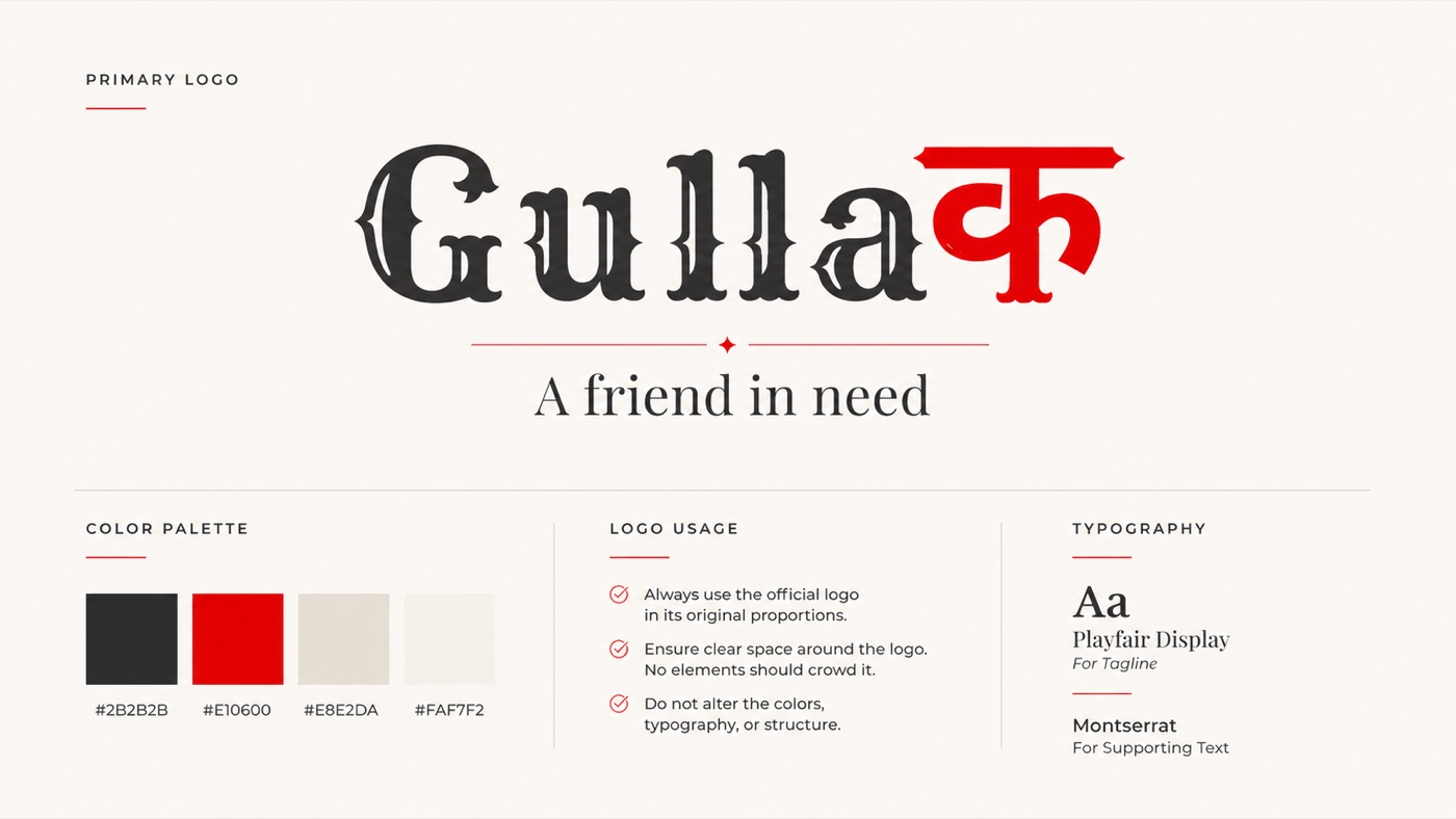
The identity guideline: primary logo, palette, usage rules and typography — Playfair Display & Montserrat
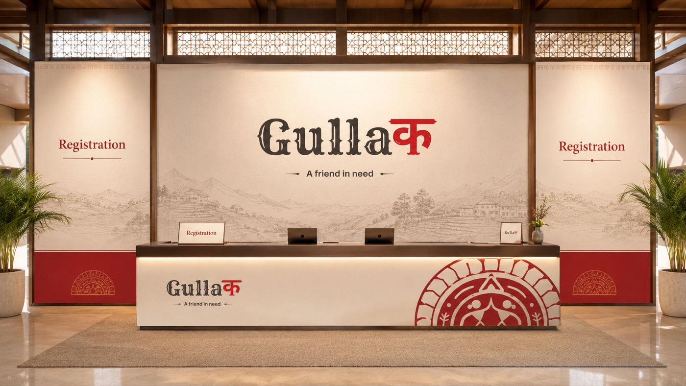
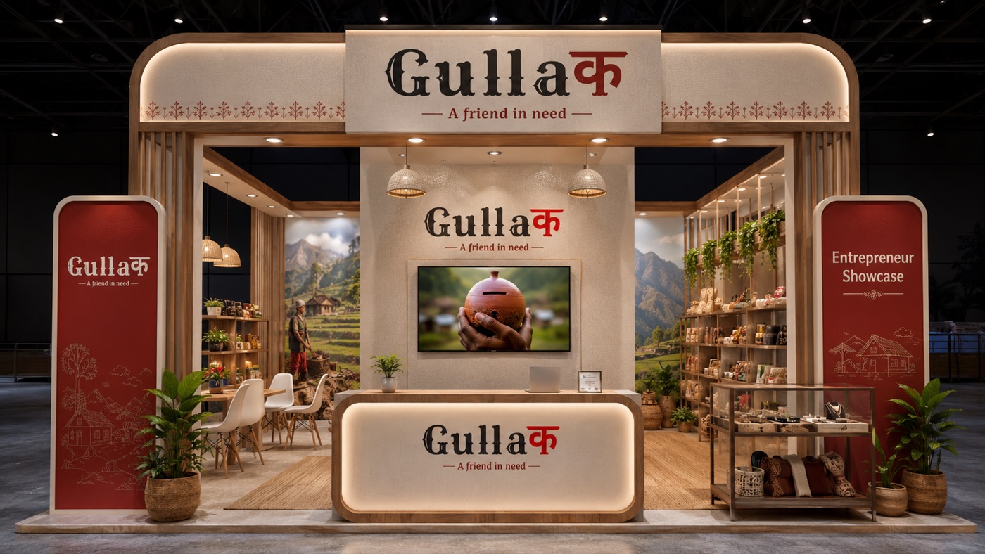
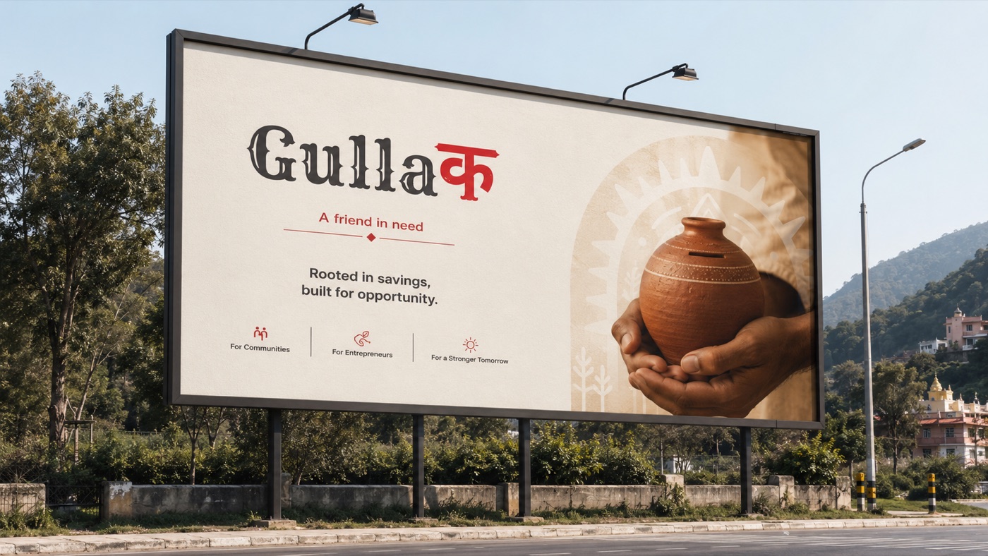
From the registration desk to the billboard on the highway — one identity carried through every environment. Tap any frame to enlarge.
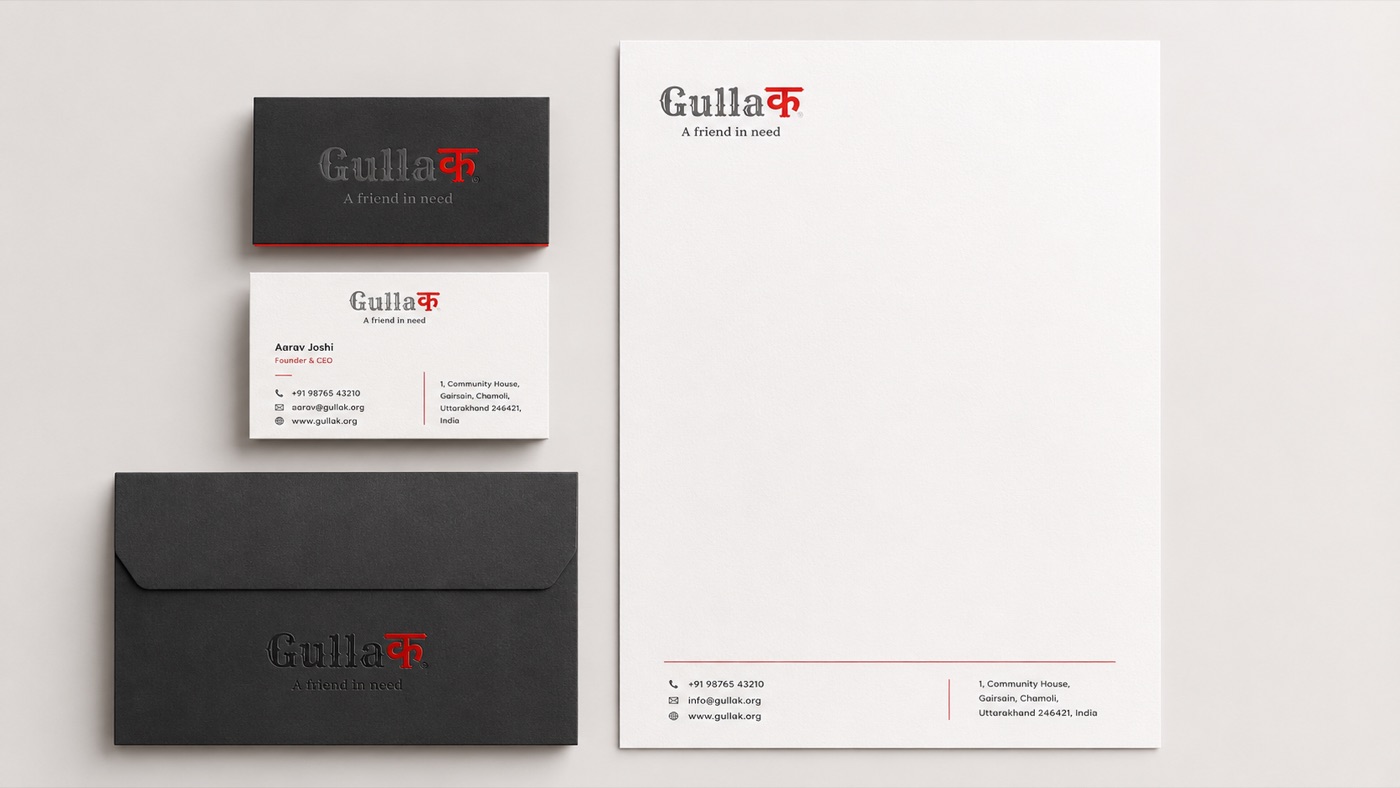
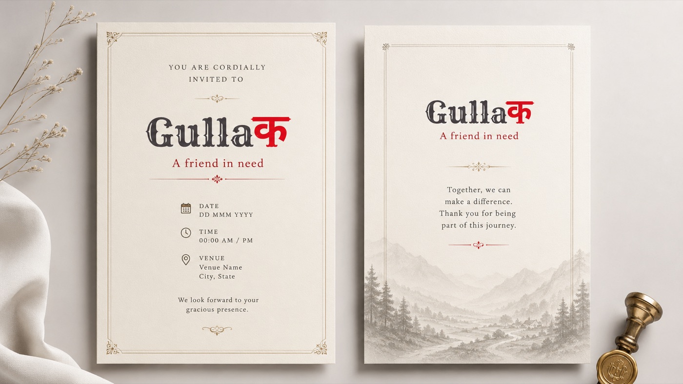
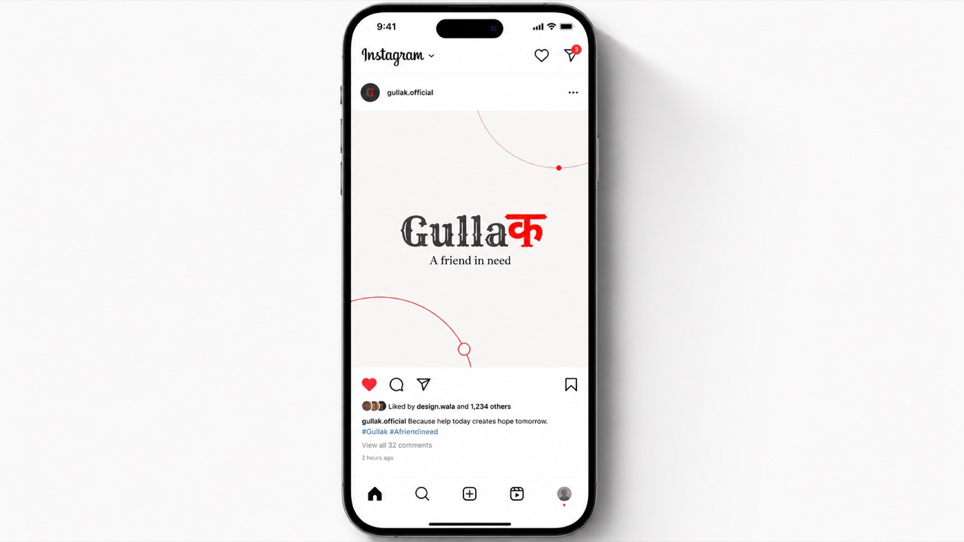
Stationery to tote bag — the same system at working scale, in the hand and on the feed. Tap any frame to enlarge.
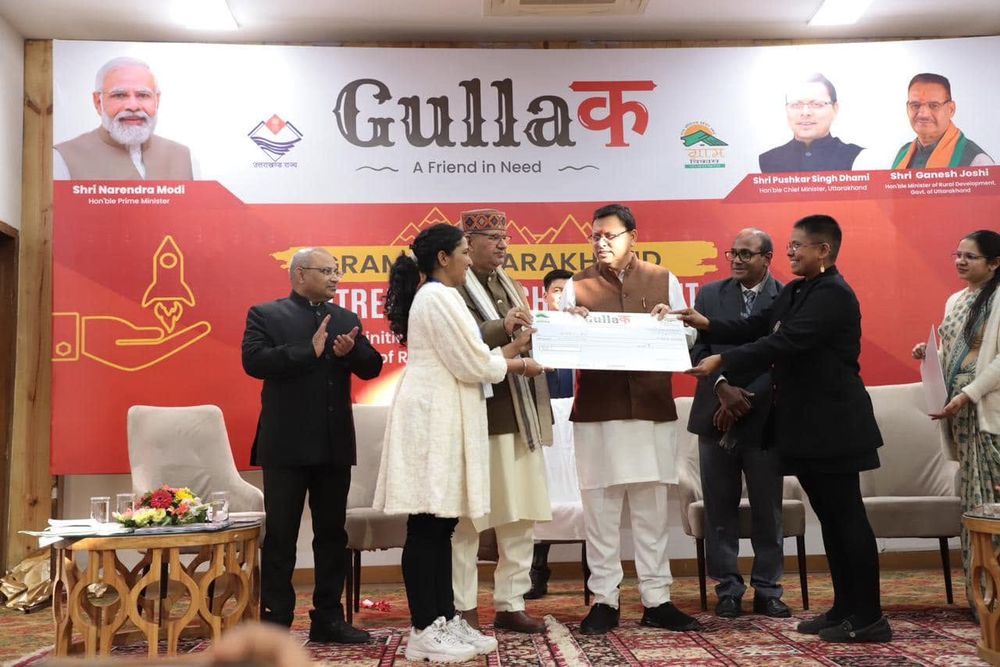
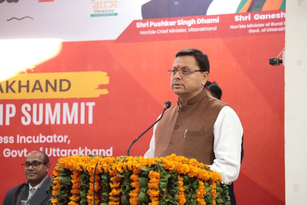
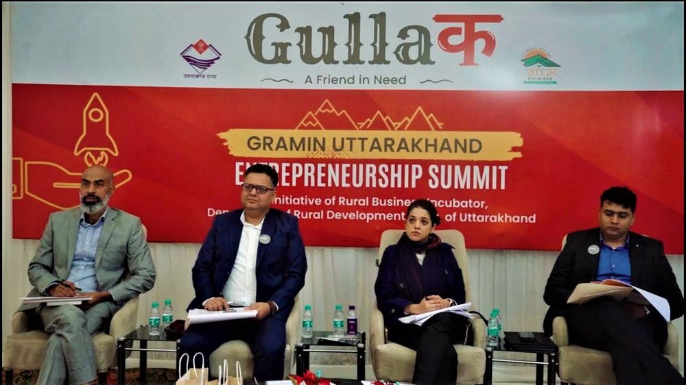
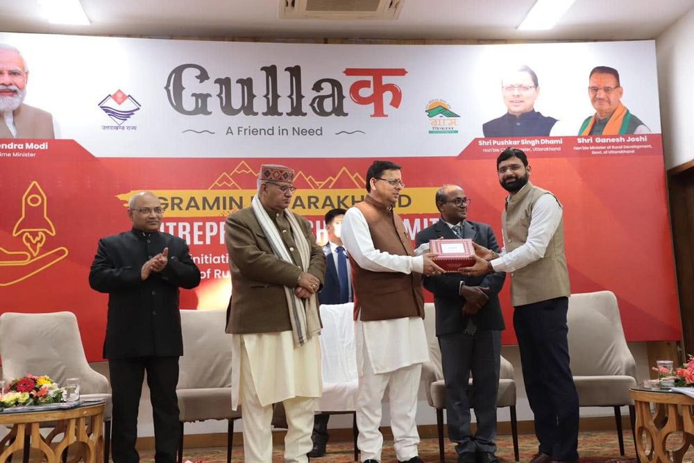
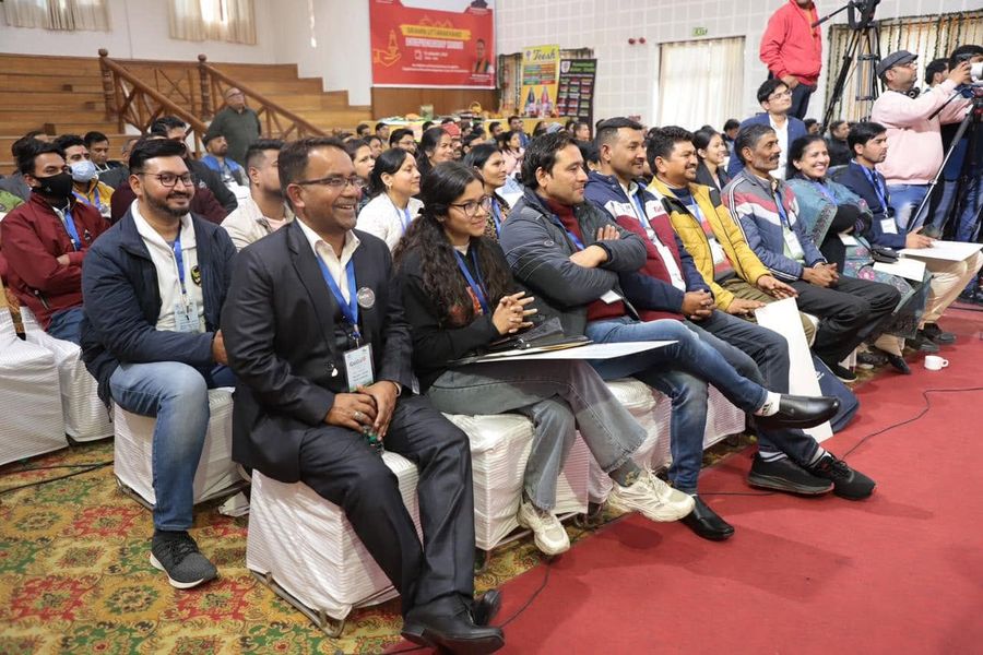
Gramin Uttarakhand Entrepreneurship Summit, an initiative of the Rural Business Incubator, Dept. of Rural Development, Govt. of Uttarakhand. Tap any frame to enlarge.
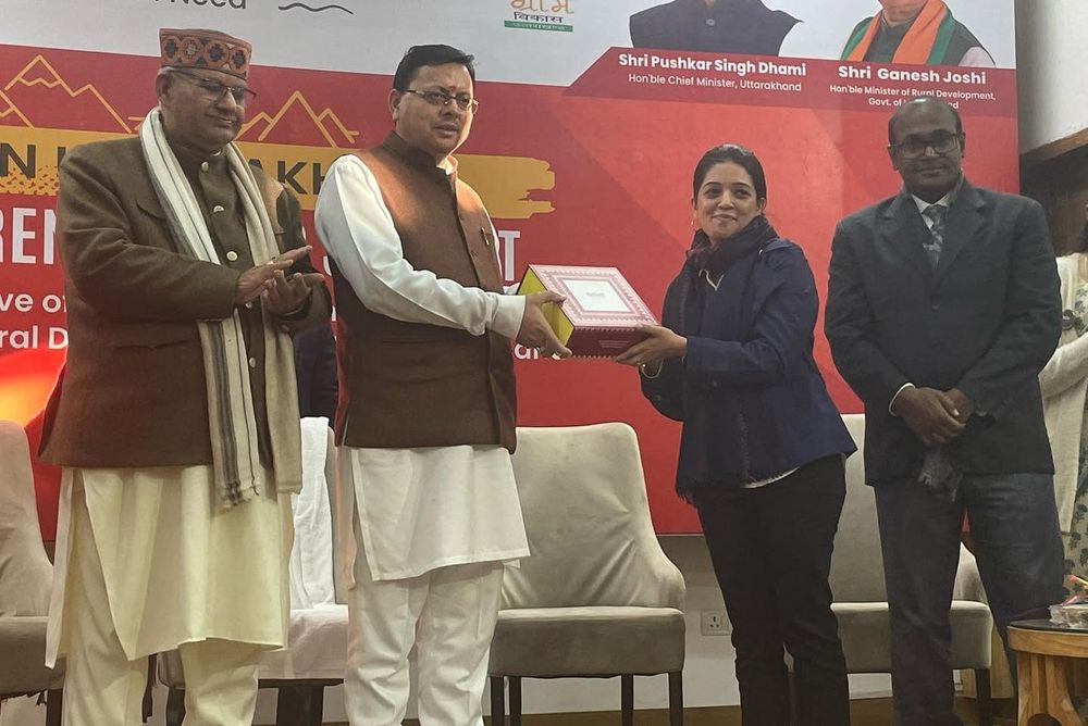
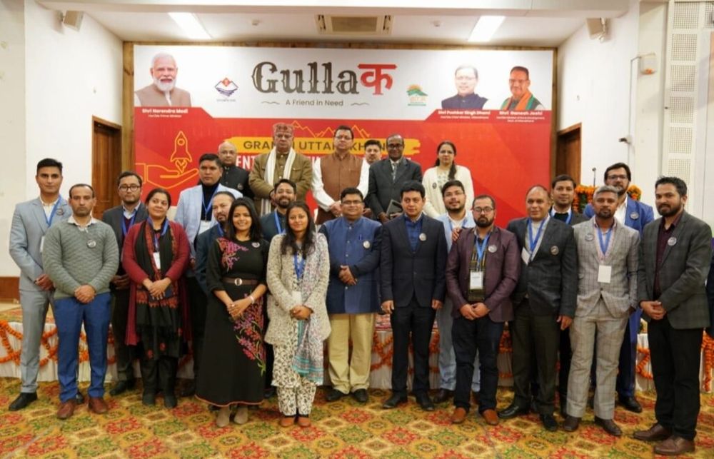
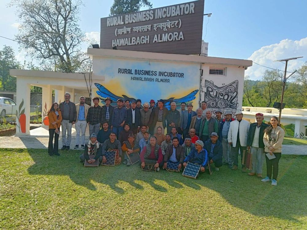
Five entrepreneurs, five films — the platform's promise told by the people living it. Press play.
"Gullak worked because the name was emotionally familiar but strategically expandable, credible in front of institutions, investors and the public."
Strategic insight · 02Identity & Event · Tehri Lake
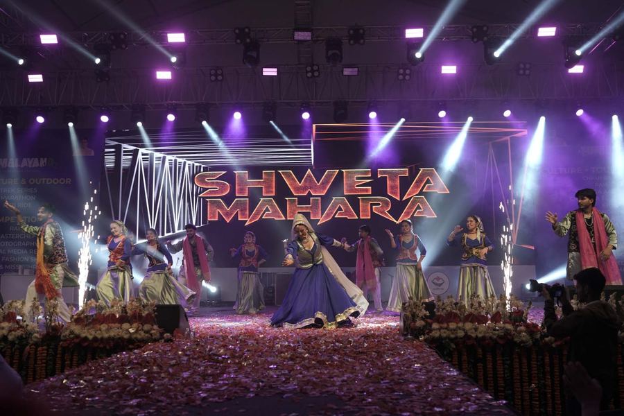
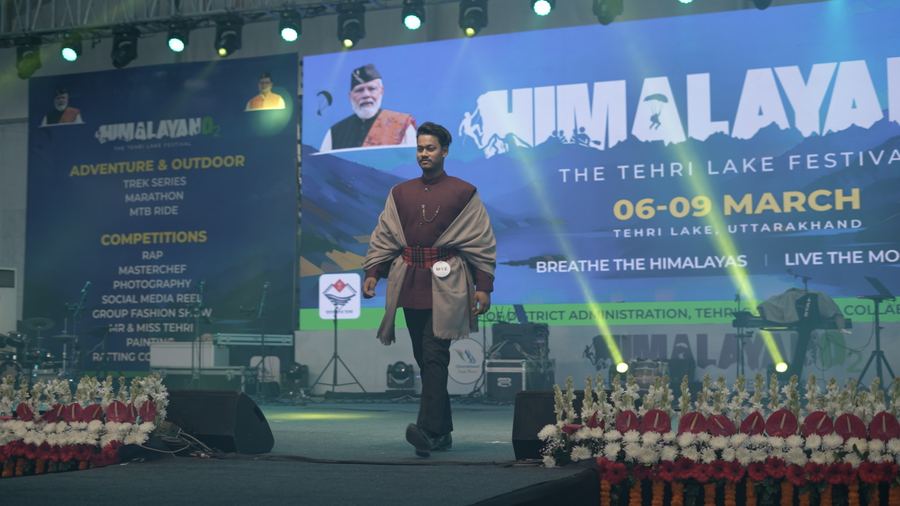
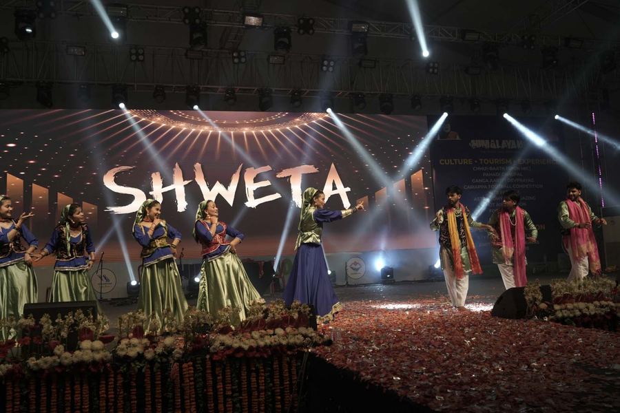
A premium destination festival celebrating adventure, culture, music, youth energy and the natural beauty of Uttarakhand — positioning Tehri not as a location, but as an experience.
A destination event with no story beyond its location.
An event identity and communication system that sold the air itself.
From a trek date on a poster to an experience people evangelise.
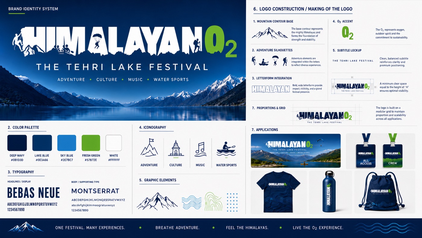
The identity system — mountain-contour wordmark, O₂ accent, palette, type and iconography
Not a venue — an experience: breathe, climb, ride, fly, compete, celebrate.
The complete event ecosystem: festival identity, outdoor communication, signage, competition branding, stage and environmental graphics.
Website experience, registrations and public-facing campaign material.
A modern festival brand with strong tourism, youth and destination pull.
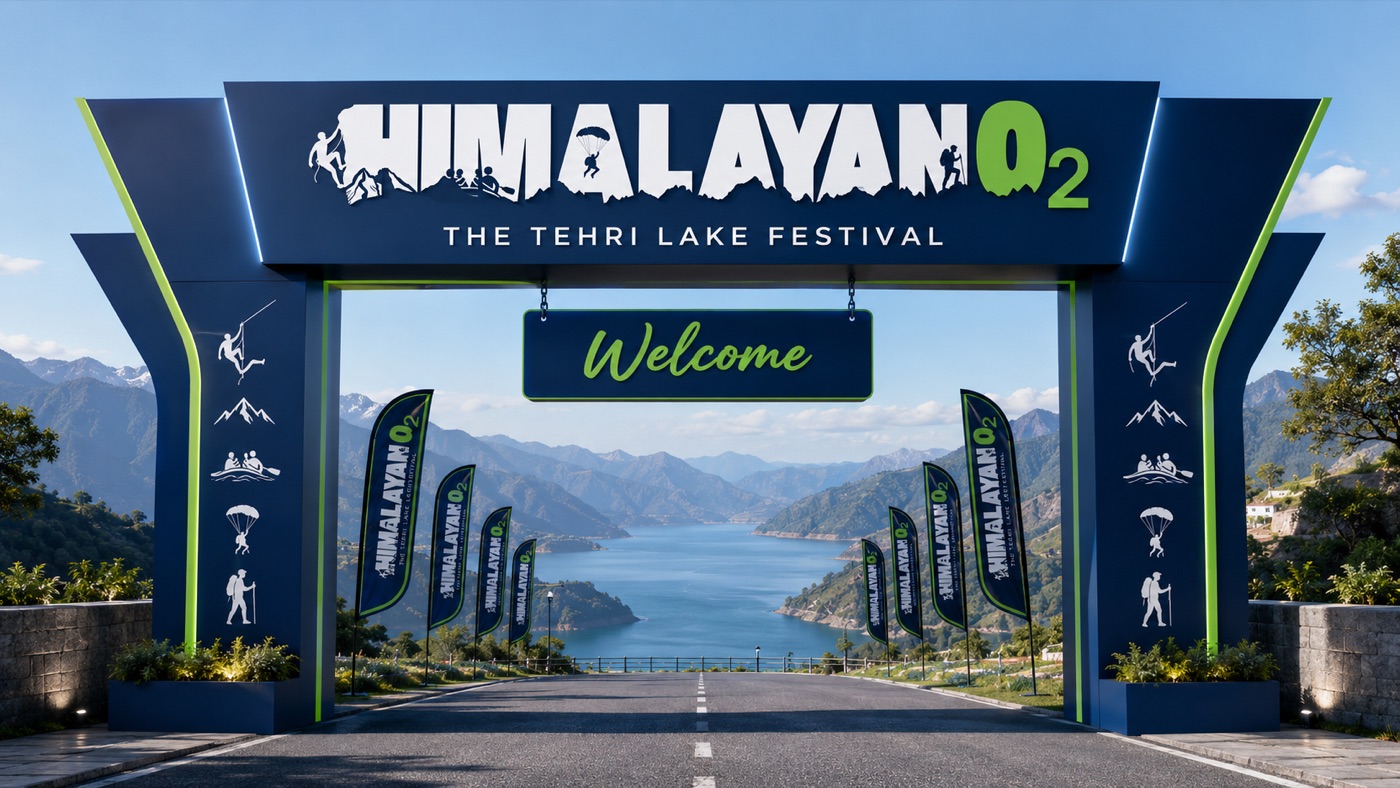
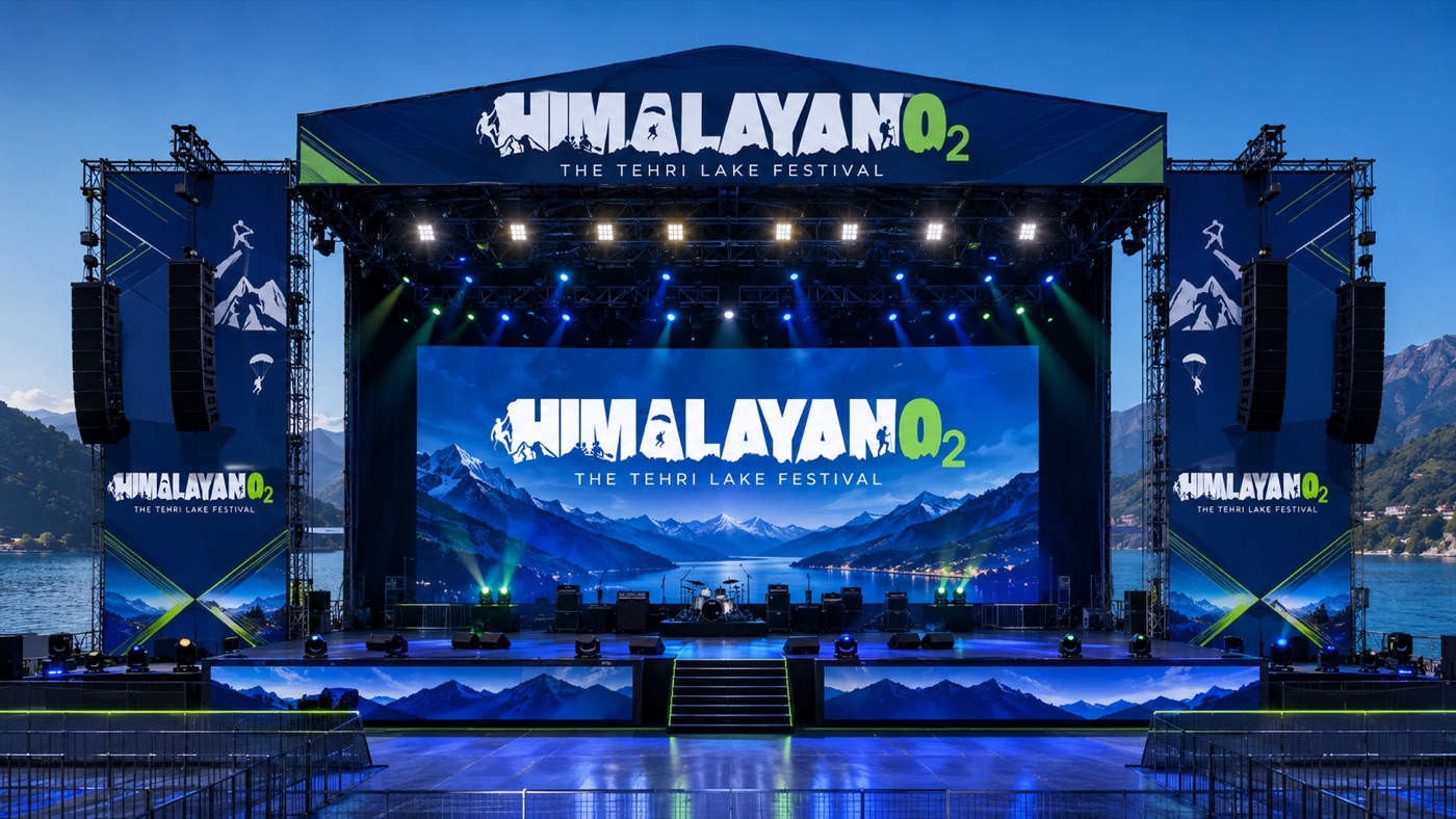
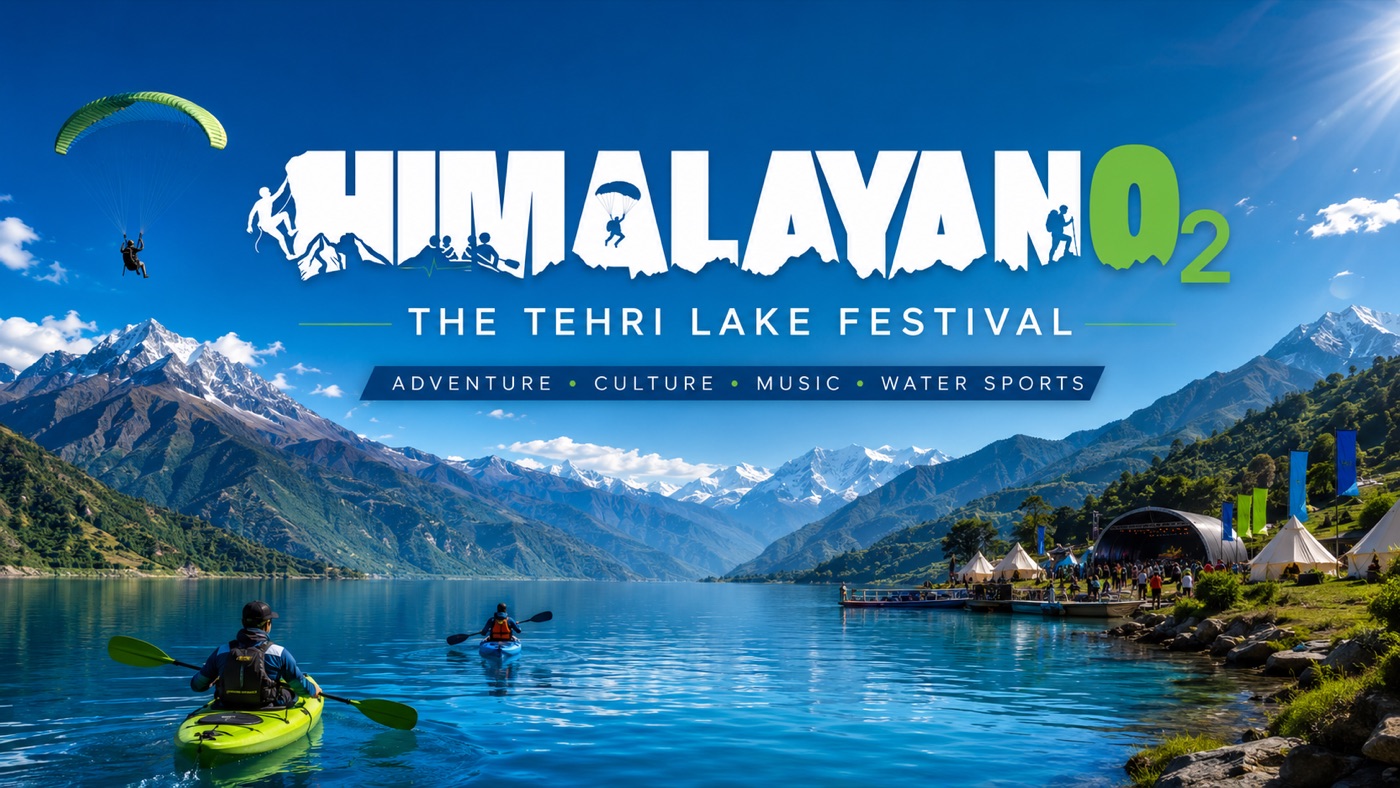
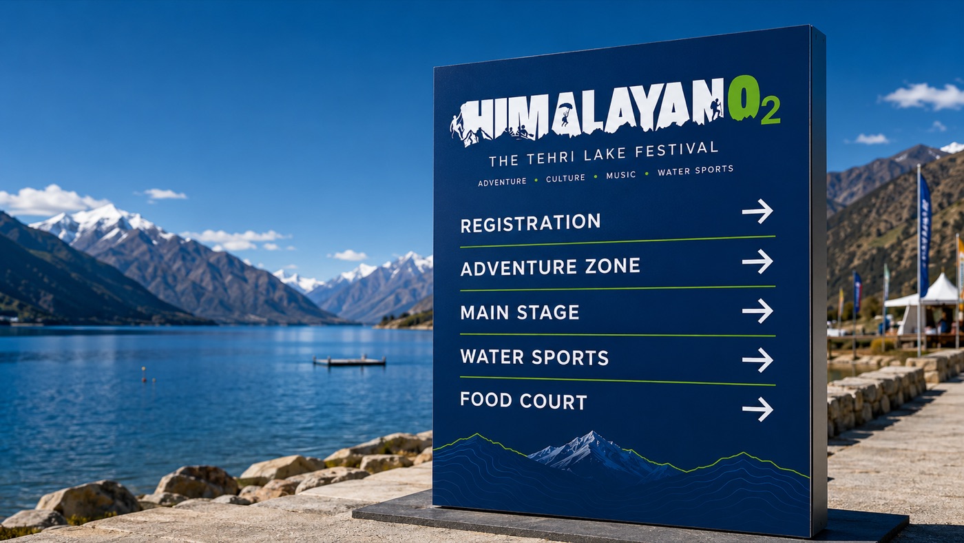
One system, every surface — from the registration kiosk to the certificate in a participant's hand. Tap to enlarge.
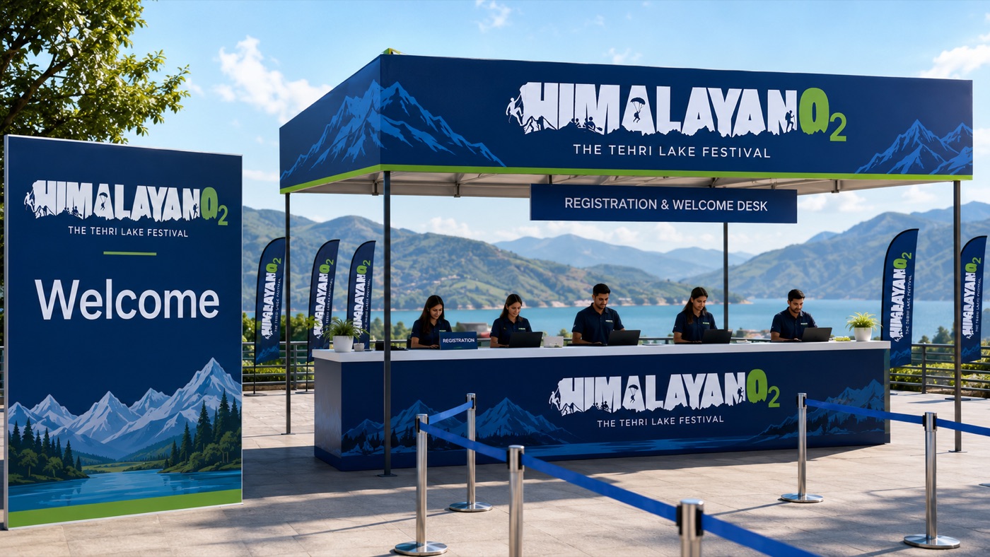
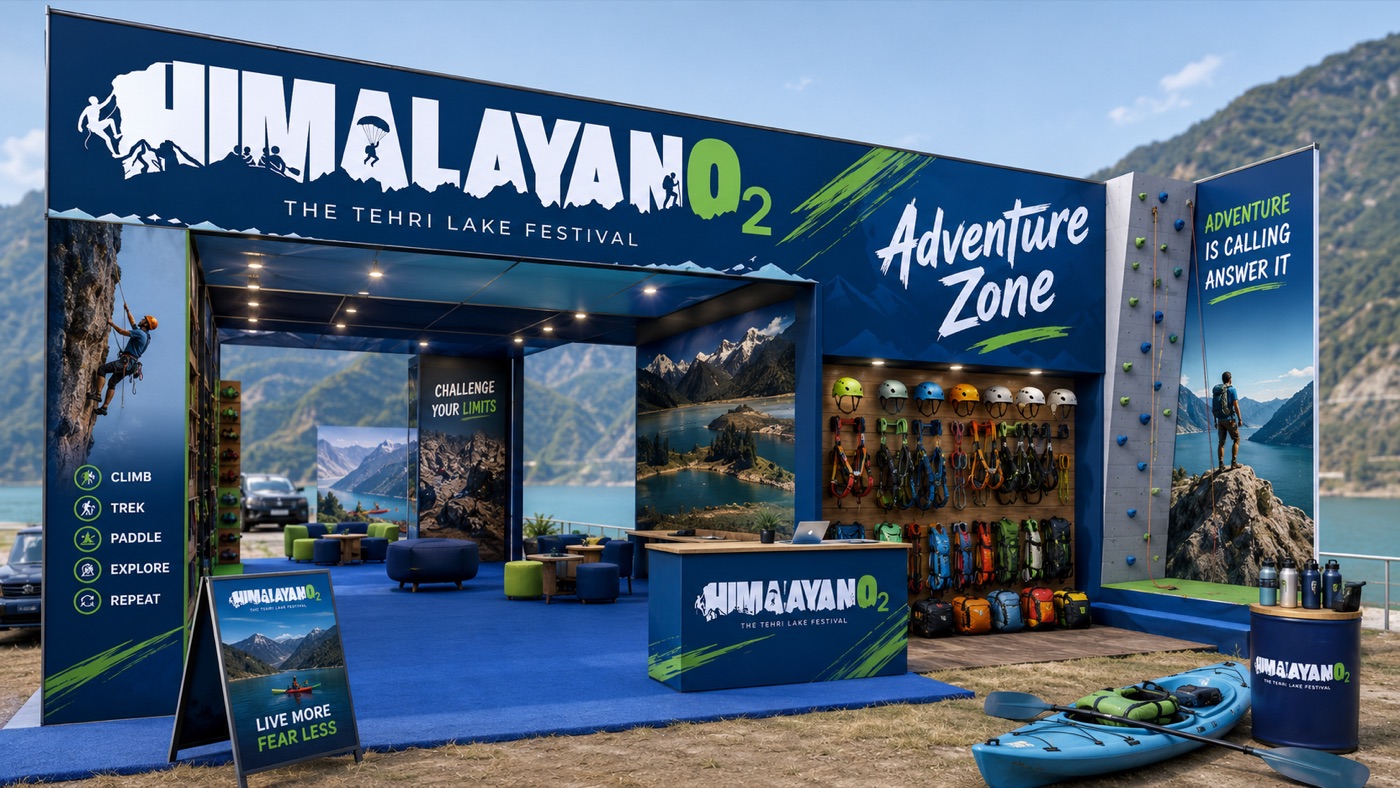
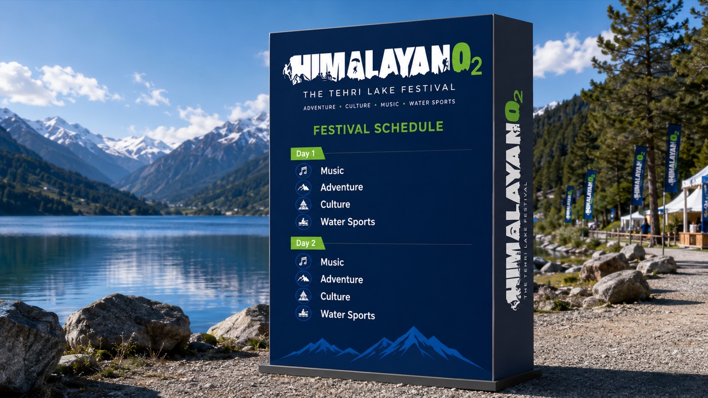
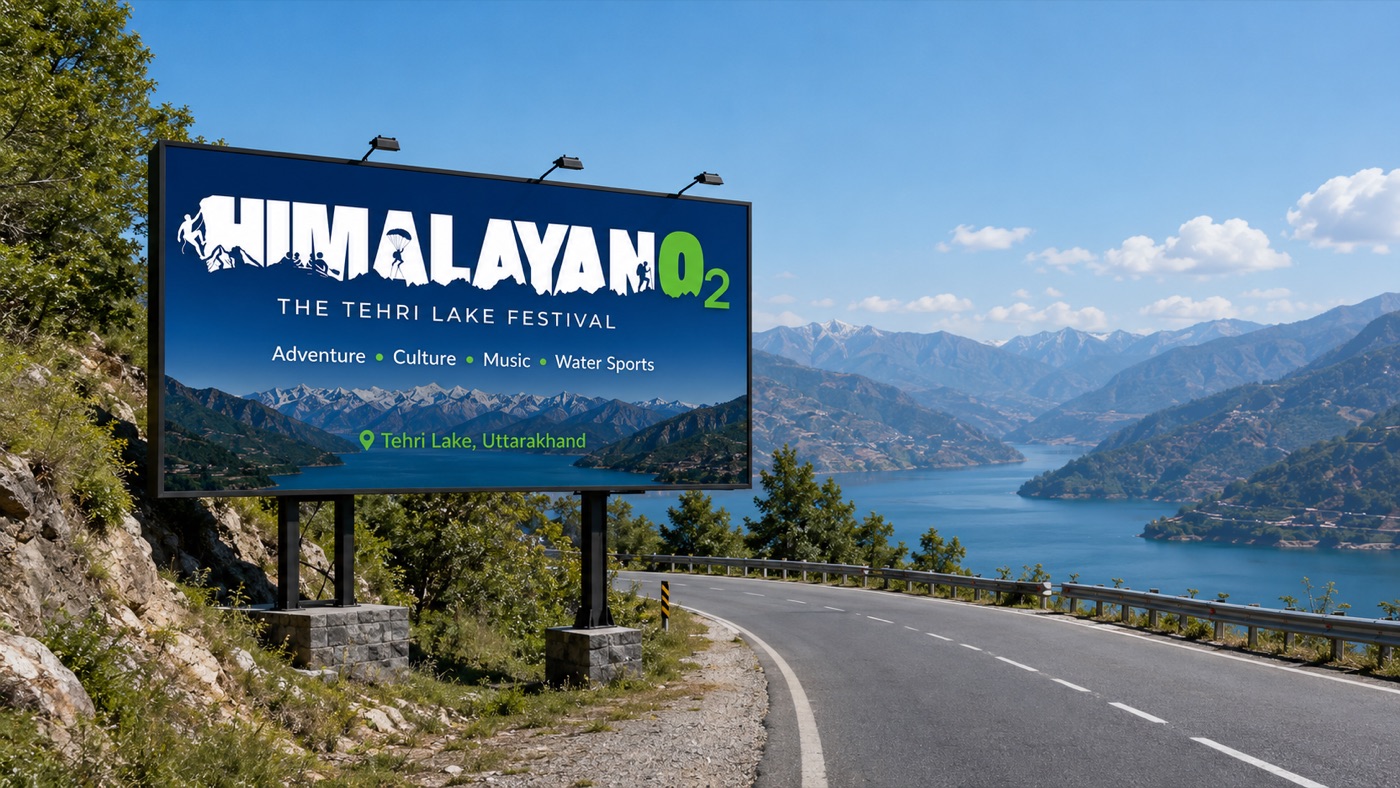
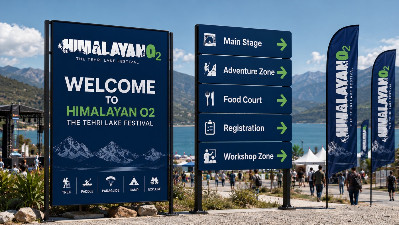
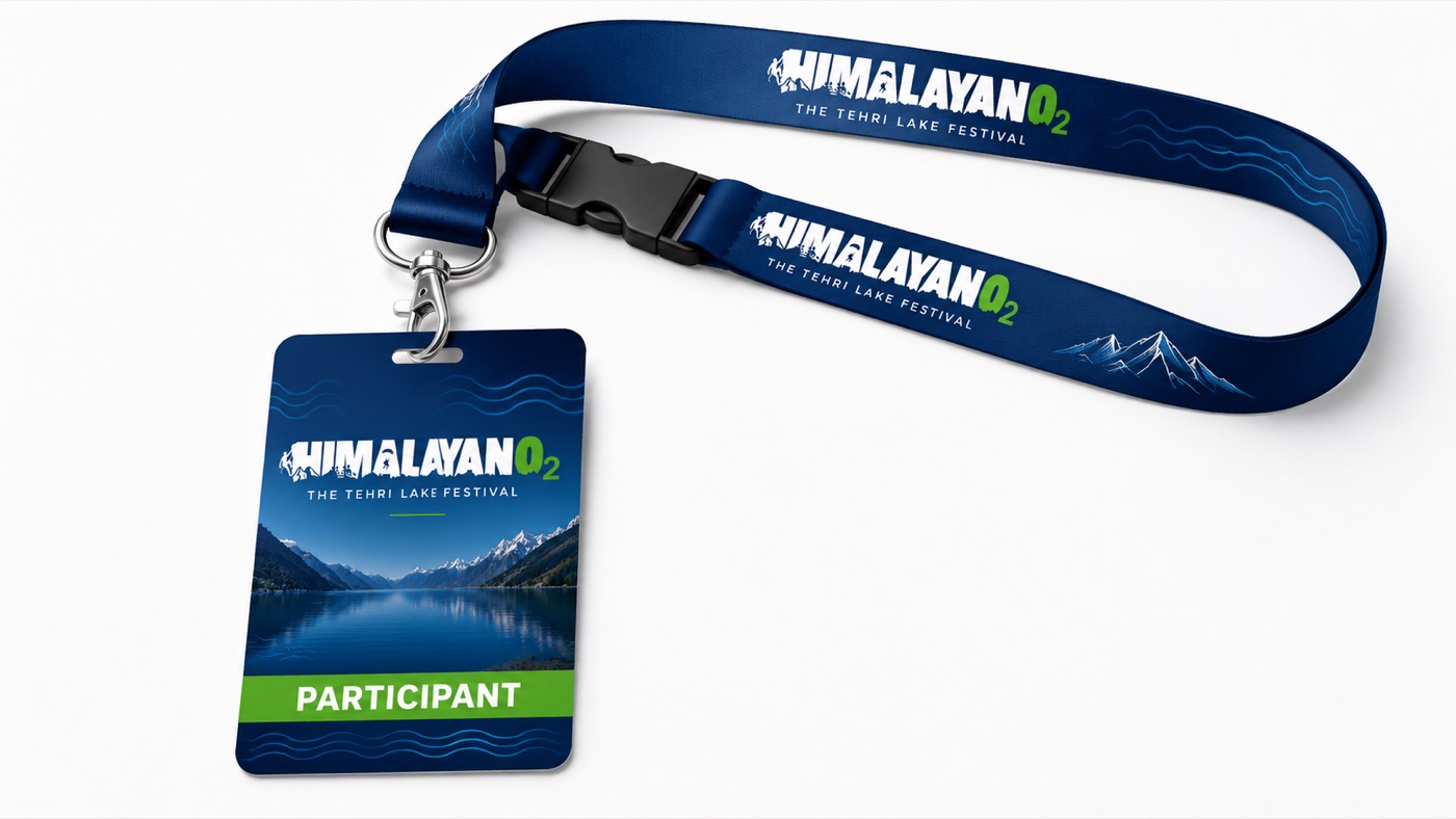
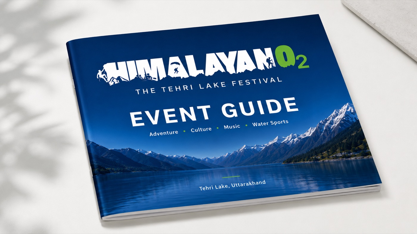
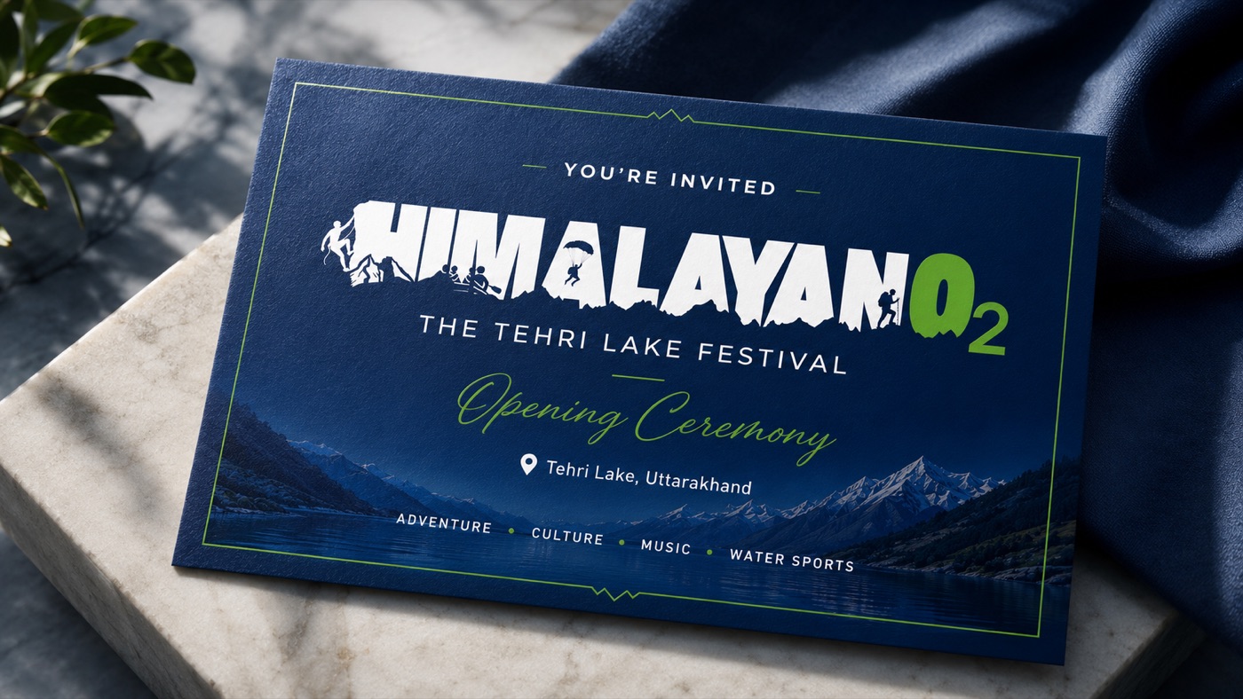
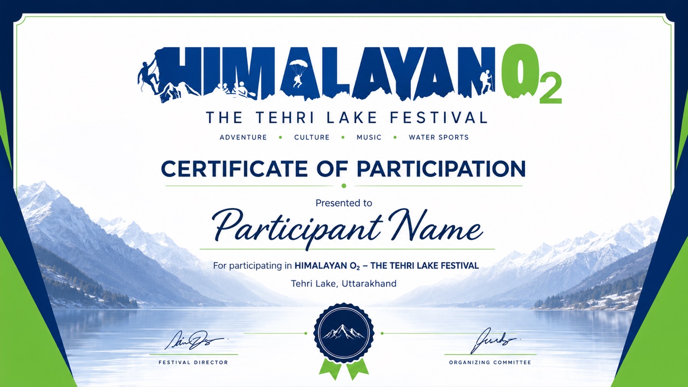
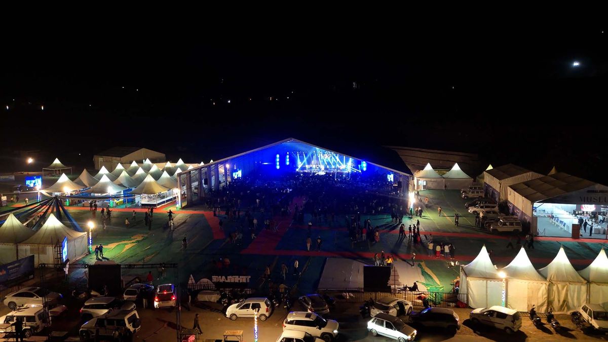
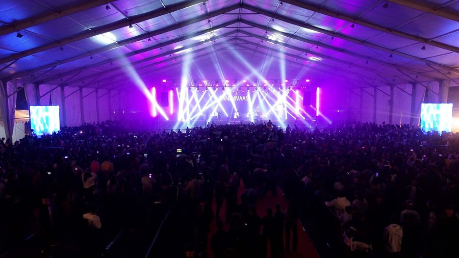
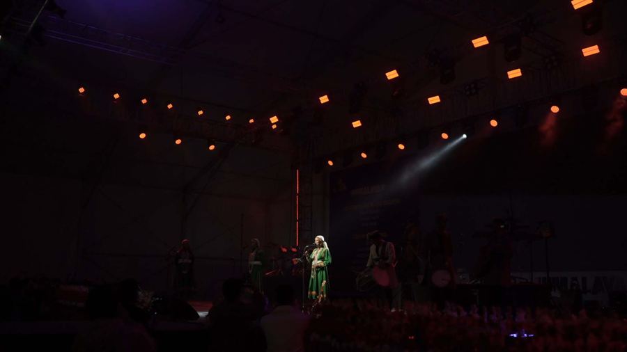
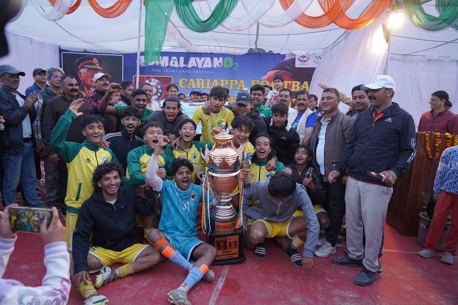
From the festival floor, 6 to 9 March, Tehri Lake, Uttarakhand. Tap any frame to enlarge.
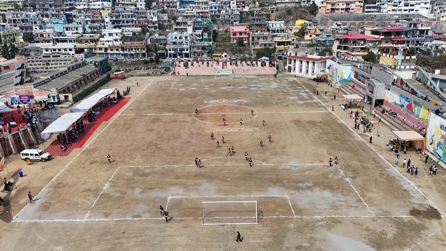
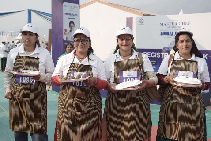
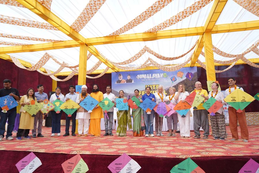
Scale & public engagement
Total participant interactions
Tracked activity categories
Live music, DJ nights and high-energy programming drew the strongest engagement.
Food Festival, Ganga Aarti and the Light & Sound Show broadened public appeal.
Trekking and local handicrafts rooted the festival in destination and local economy.
As covered by national and regional press after the 6 to 9 March festival.
Across nearly 15 competitions, as stated by the Hon'ble Governor of Uttarakhand at the closing.
Cash prizes, Tehri Dam guided tours and festival honours for top performers.
Organised by the District Administration, Tehri Garhwal with the Uttarakhand Tourism Development Board, under the PM-launched Gham Tapo winter tourism initiative.
Amit Trivedi and Pandavaas on the main stage; coverage in Republic, Free Press Journal, Garhwal Post and travel press.
Sources: Free Press Journal (9 Mar 2026), Garhwal Post, Republic World, Travel And Tour World, himalayano2.com
"The brand was never only about Tehri Lake; it was about what people could do, feel and remember there."
Strategic insight · 03Communication · Saras Aajeevika 2025
Integrated communication around rural women artisans, self-help groups, enterprise building and the Lakhpati Didi narrative — turning a welfare message into a story of dignity, income, skill and rural leadership.
Rural self-help produce, presented in government language nobody shops in.
A communication system that gave the produce a voice buyers instinctively trust.
From scheme stall to marketplace brand.
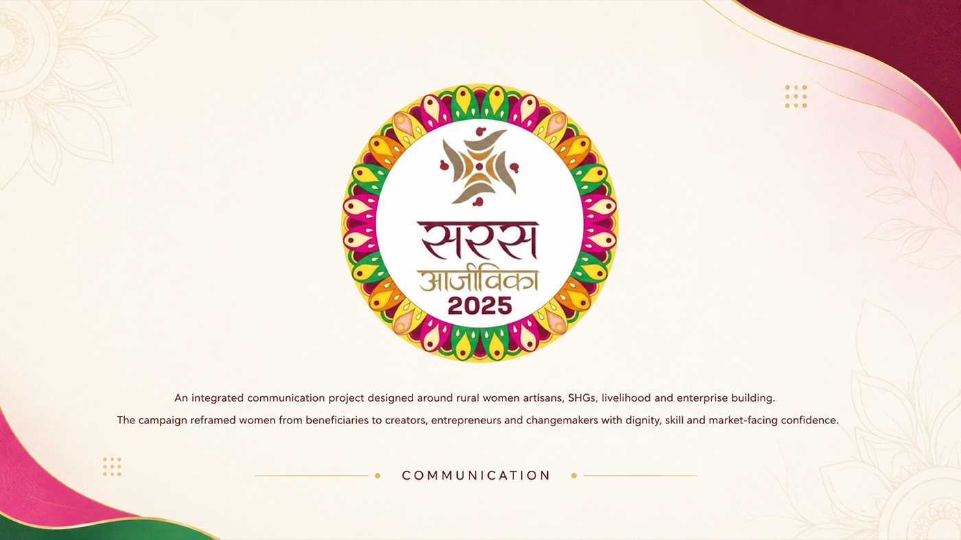
The mark and the brief — a hand-painted mandala of craft motifs around the Saras Aajeevika 2025 wordmark
The narrative shift
"Beneficiaries of a welfare scheme, receiving support."

Launch video
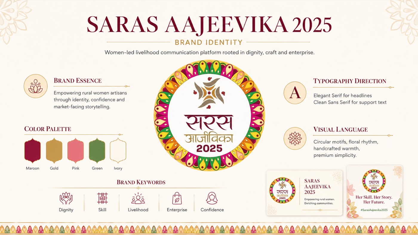
The identity system — essence, maroon-and-gold palette, type direction and floral visual language
The event, built in the identity
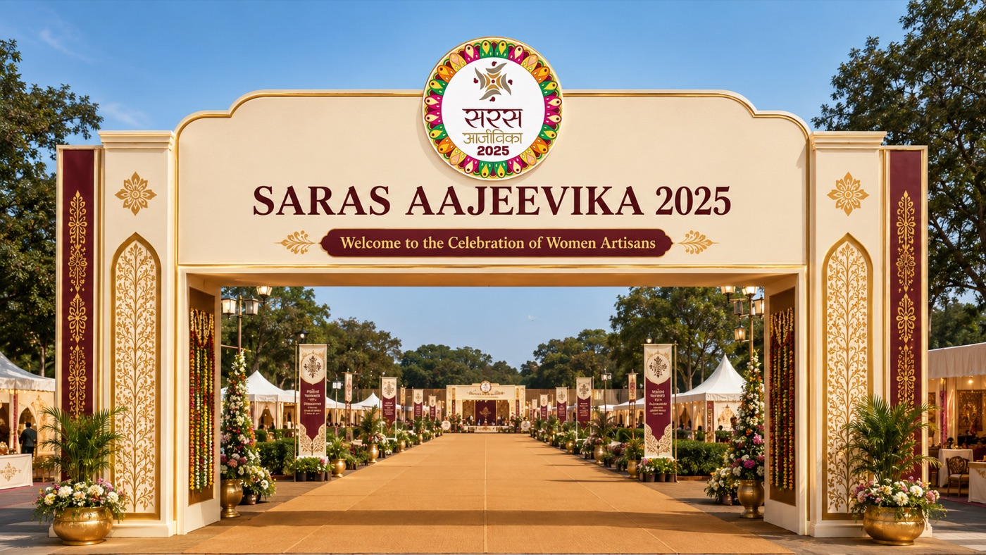
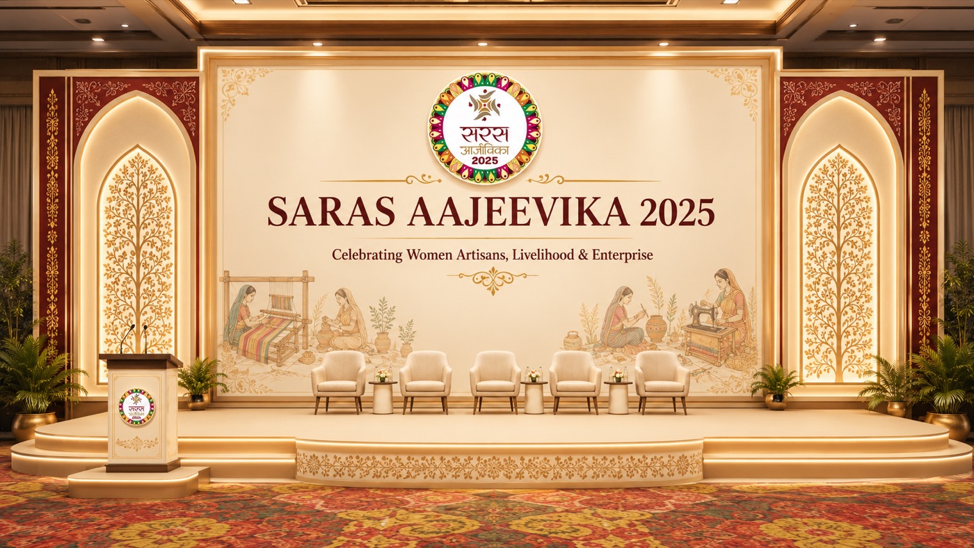
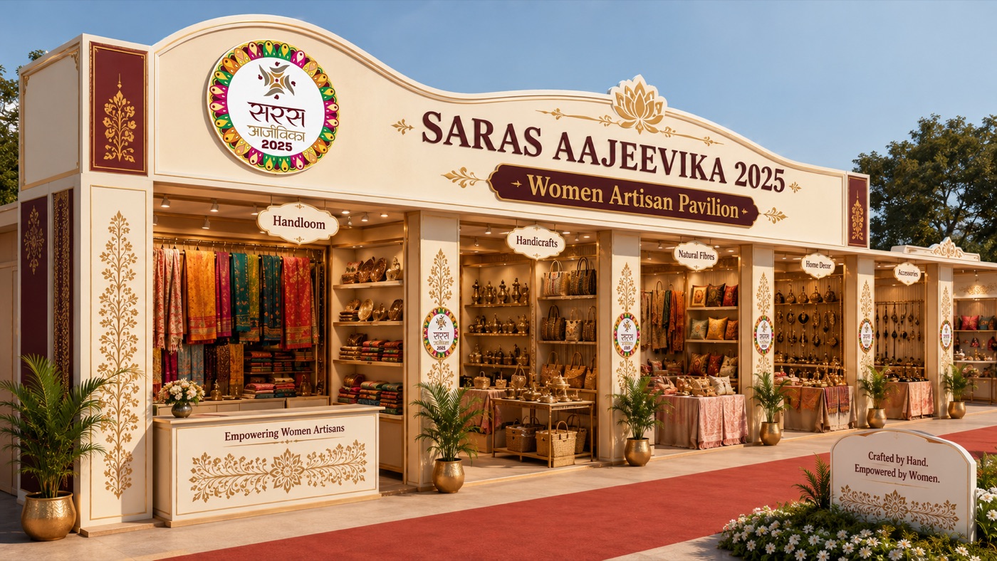
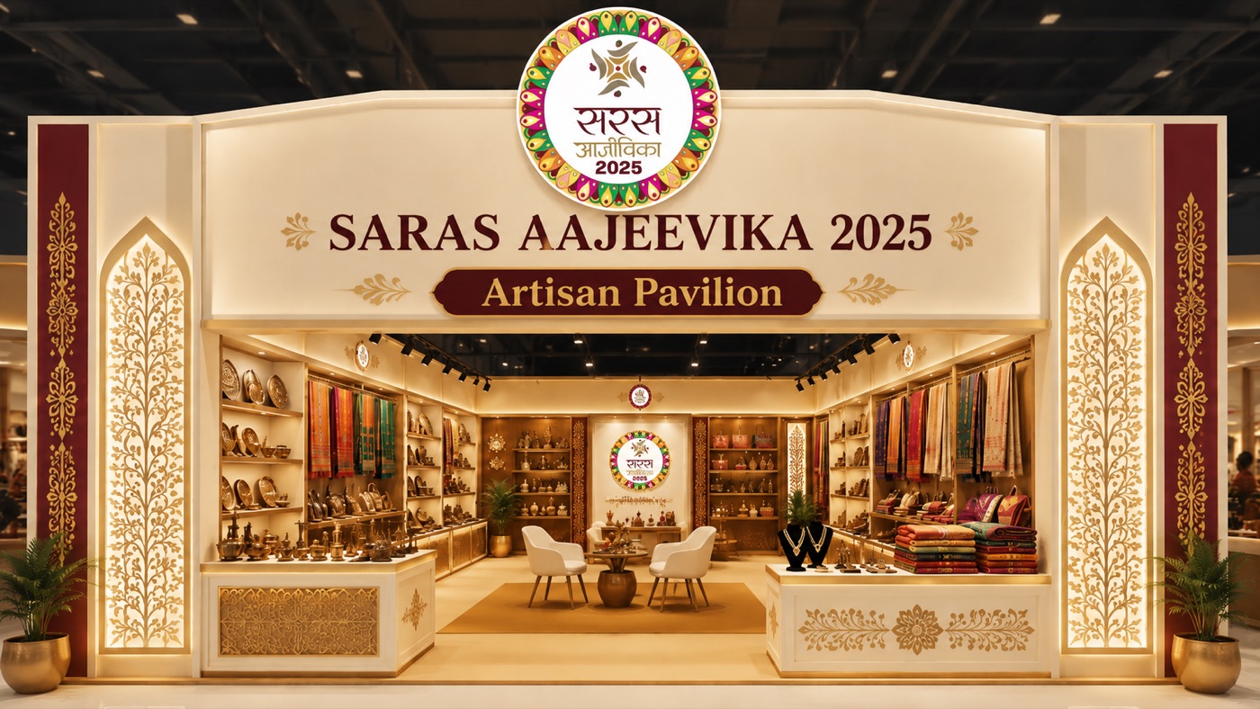
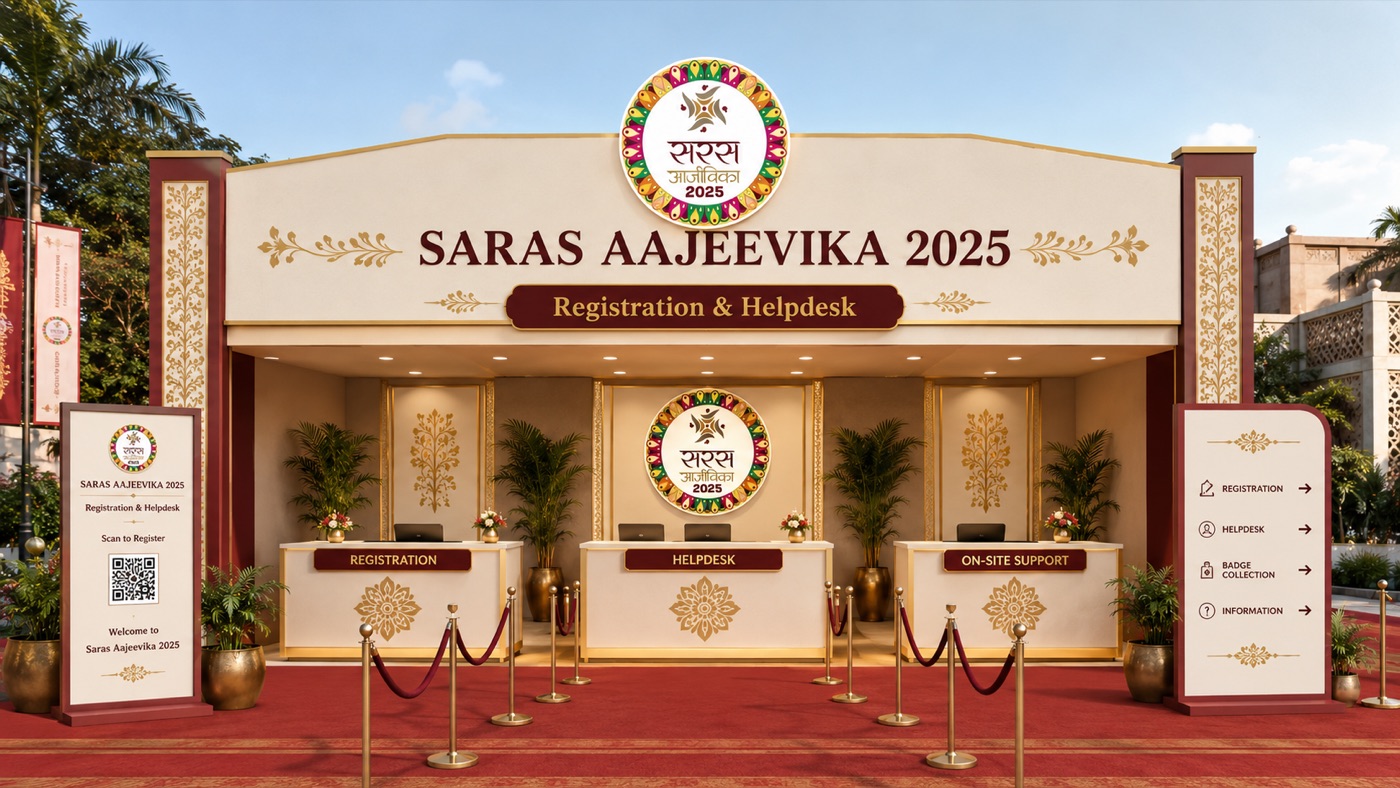
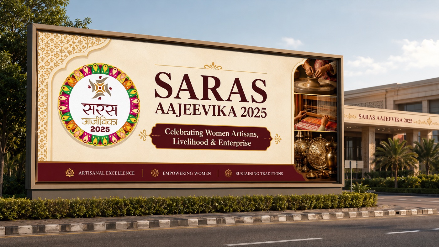
One system on every surface — from the invitation in an official's hand to the tag on a jute bag. Tap to enlarge.
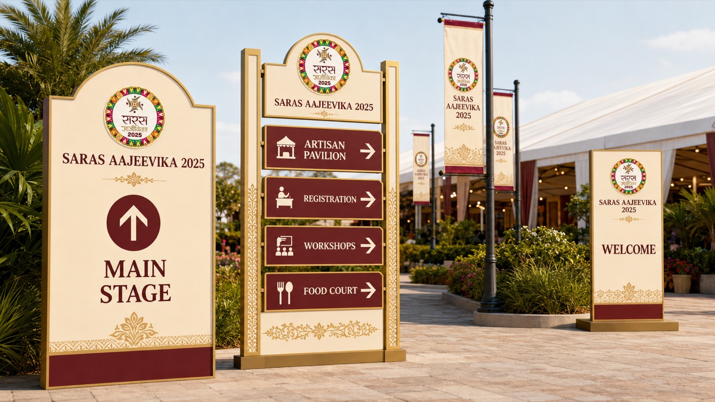
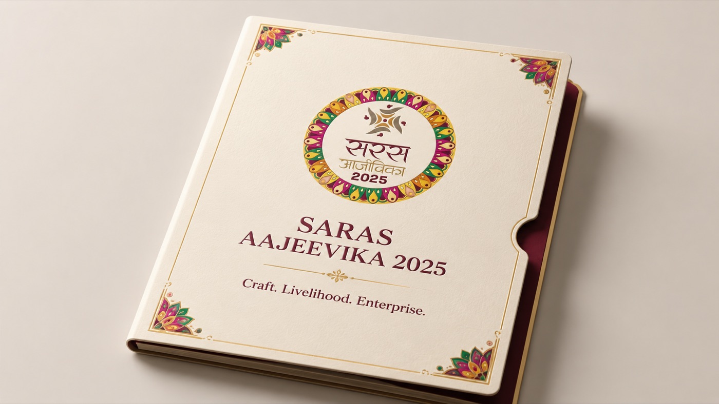
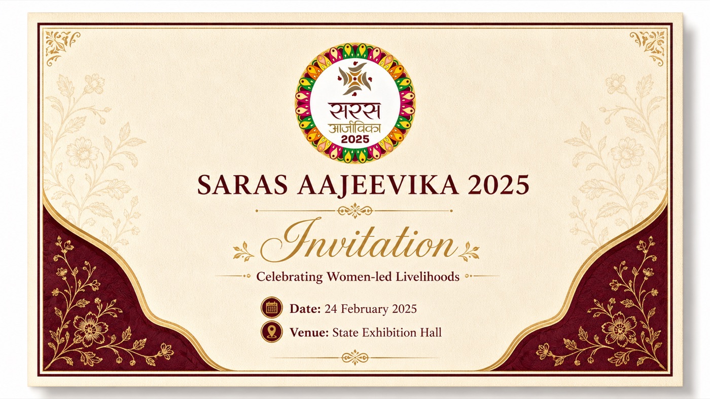
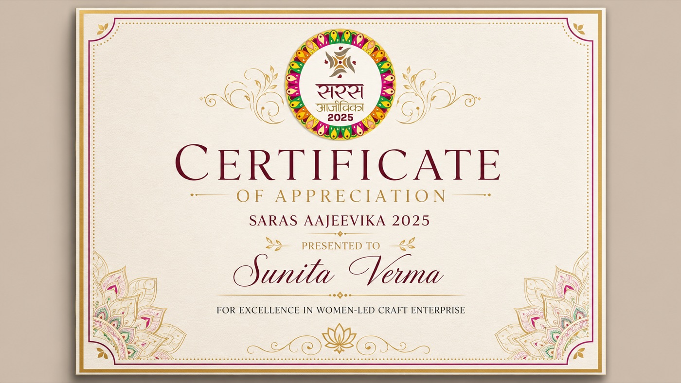
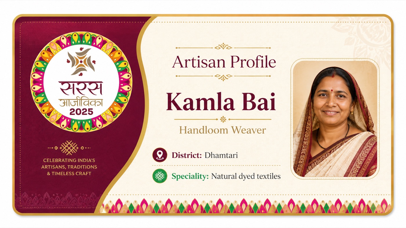
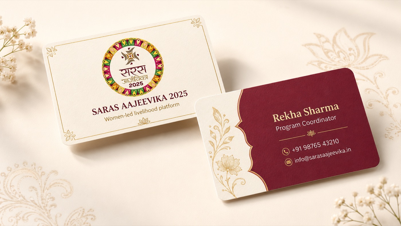
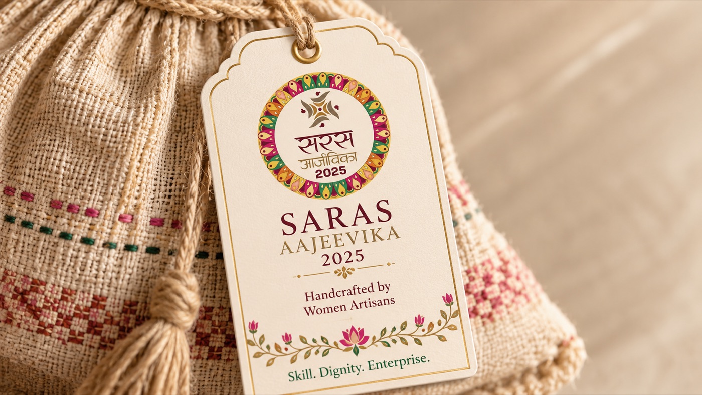
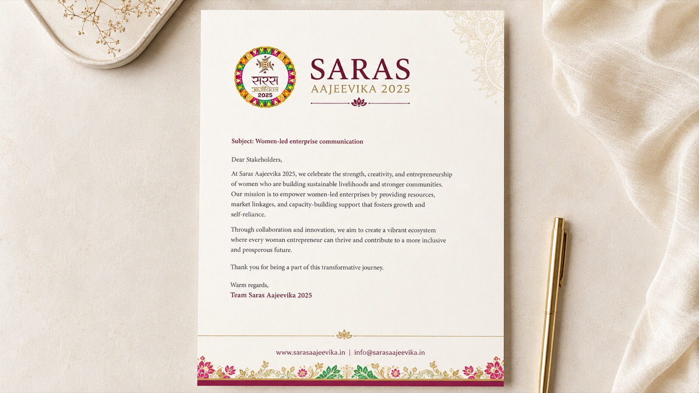
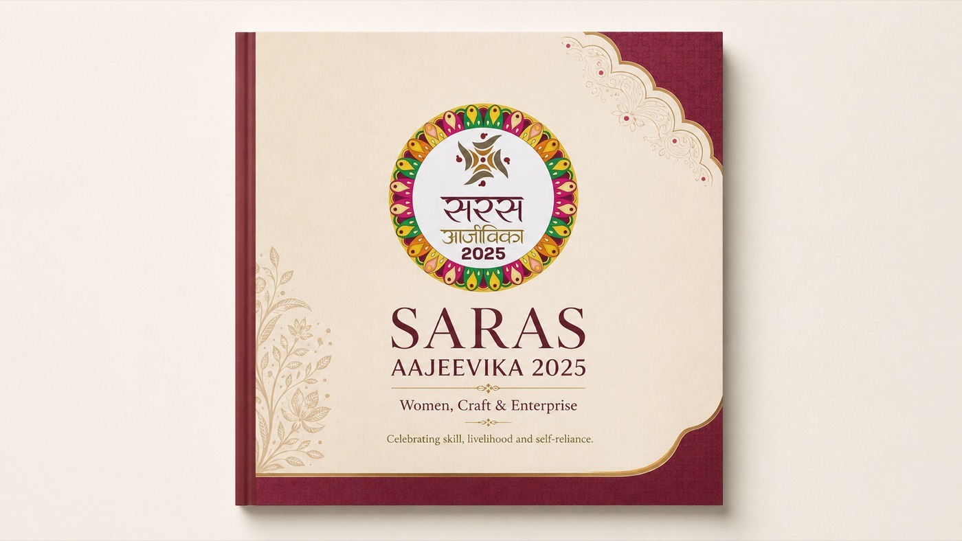
The standee series, at every doorway
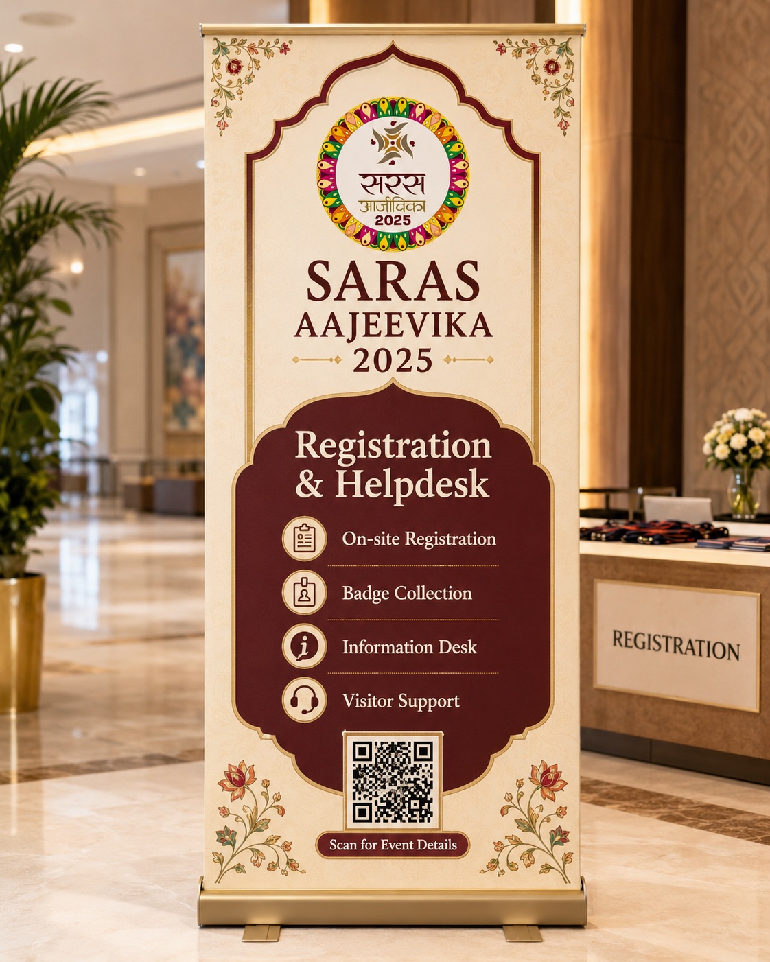
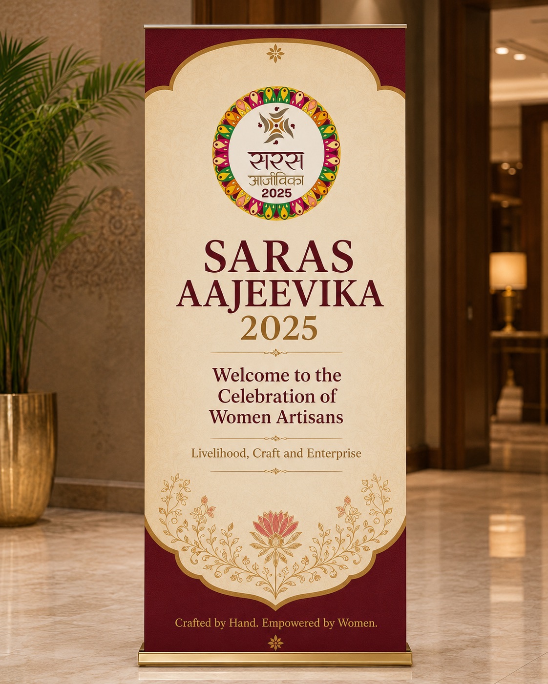
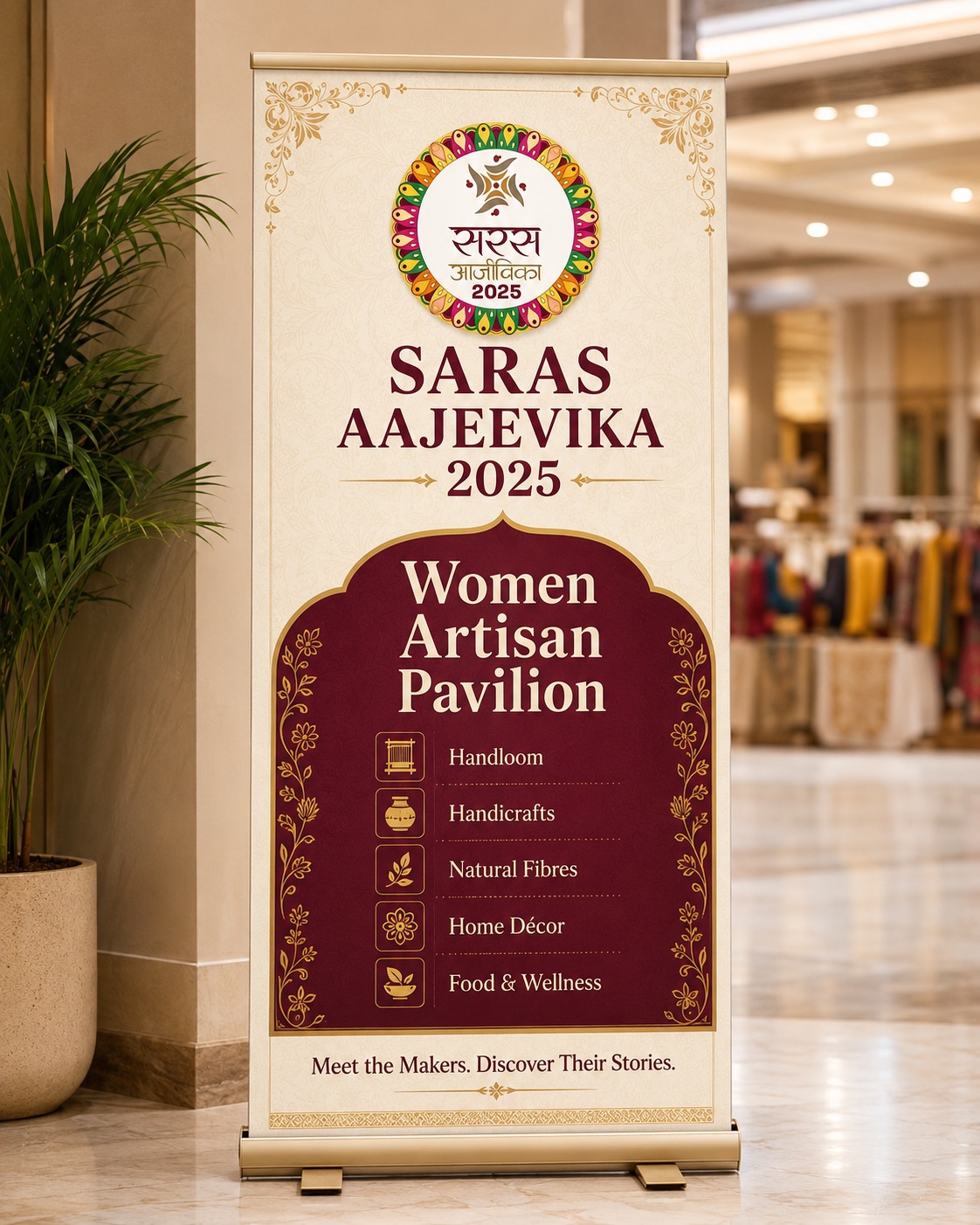
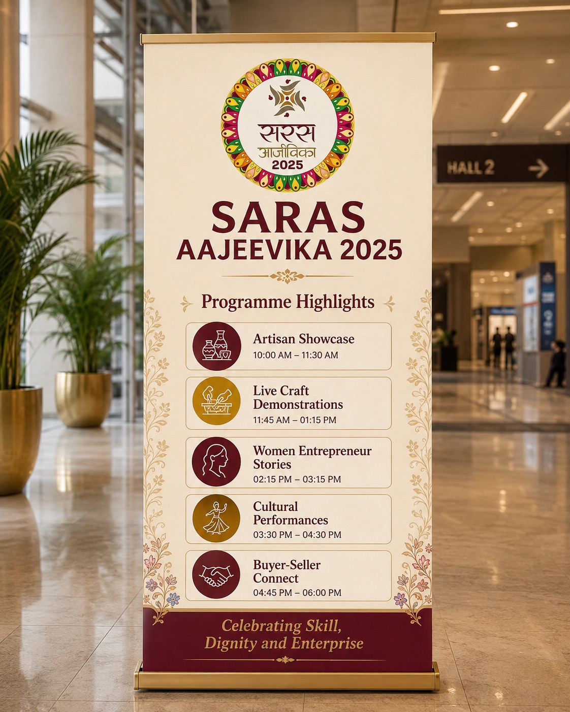
Saras Aajeevika Mela 2025, the 27th edition, ran 5 to 22 September at Dhyanchand National Stadium, New Delhi.
Organised by the Ministry of Rural Development under DAY-NRLM; the first Mela fully led by Lakhpati Didis.
SHG entrepreneurs from every state and union territory, selling across about 200 stalls.
The national mission context: DAY-NRLM has mobilised over 10 crore rural households into SHGs.
First time hosted in Delhi with all components together: exhibition, food court and cultural programming.
Sources: Press Information Bureau, Ministry of Rural Development (dord.gov.in), News On AIR, Hindustan Times
Storytelling system: five moves
"Saras moved rural women from the frame of beneficiaries to the frame of creators, entrepreneurs and changemakers — not just preserving traditional skills, but building sustainable futures."
Strategic insight · 04Campaign communication · Youth mobilisation
A nationwide youth mobilisation campaign by BJYM around fitness, healthy living and Nasha Mukt Bharat, held during Seva Pakhwada and timed to 21 September 2025, where a public run was shaped into a high-energy national youth movement.
A public run at risk of being one more fitness event on a Sunday.
A belief campaign — teaser series, Bollywood culture-plays, mascot films, a 75-city system.
From a marathon to a national youth movement against addiction.
The strategic thought
It was not treated as just a marathon. It was shaped as a public participation moment where fitness, national service, youth energy and anti-drug awareness came together under one clear message.
A youth campaign on fitness, Nasha Mukt Bharat and Seva Pakhwada, tied to 21 September 2025.
A sharp, youth-facing visual language built to feel energetic, participative and movement-driven.
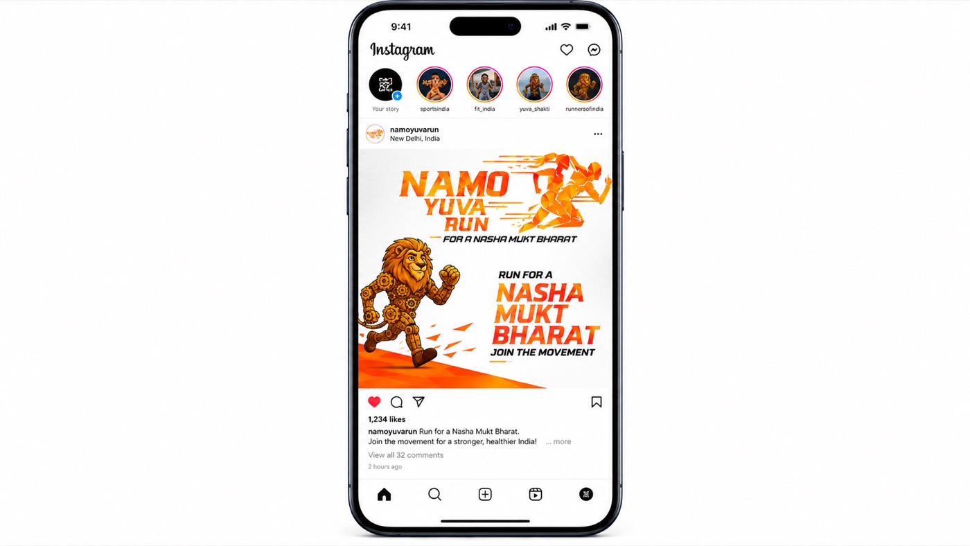
Campaign communication, digital and social creatives, youth messaging, event branding support, and reel and video-led amplification.
A public run reframed as a national youth movement, across 75 locations in Bharat.
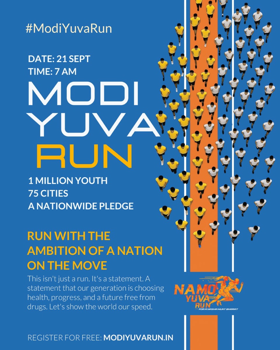
Hero campaign creative
A teaser-led social set built around one repeated idea: one path breaks you, the other makes you.
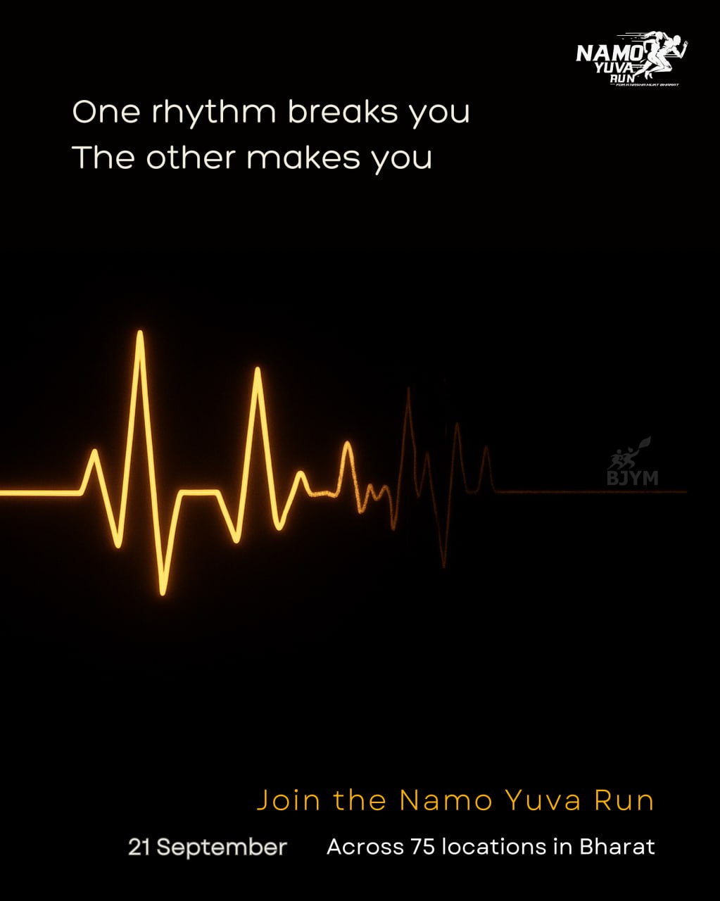
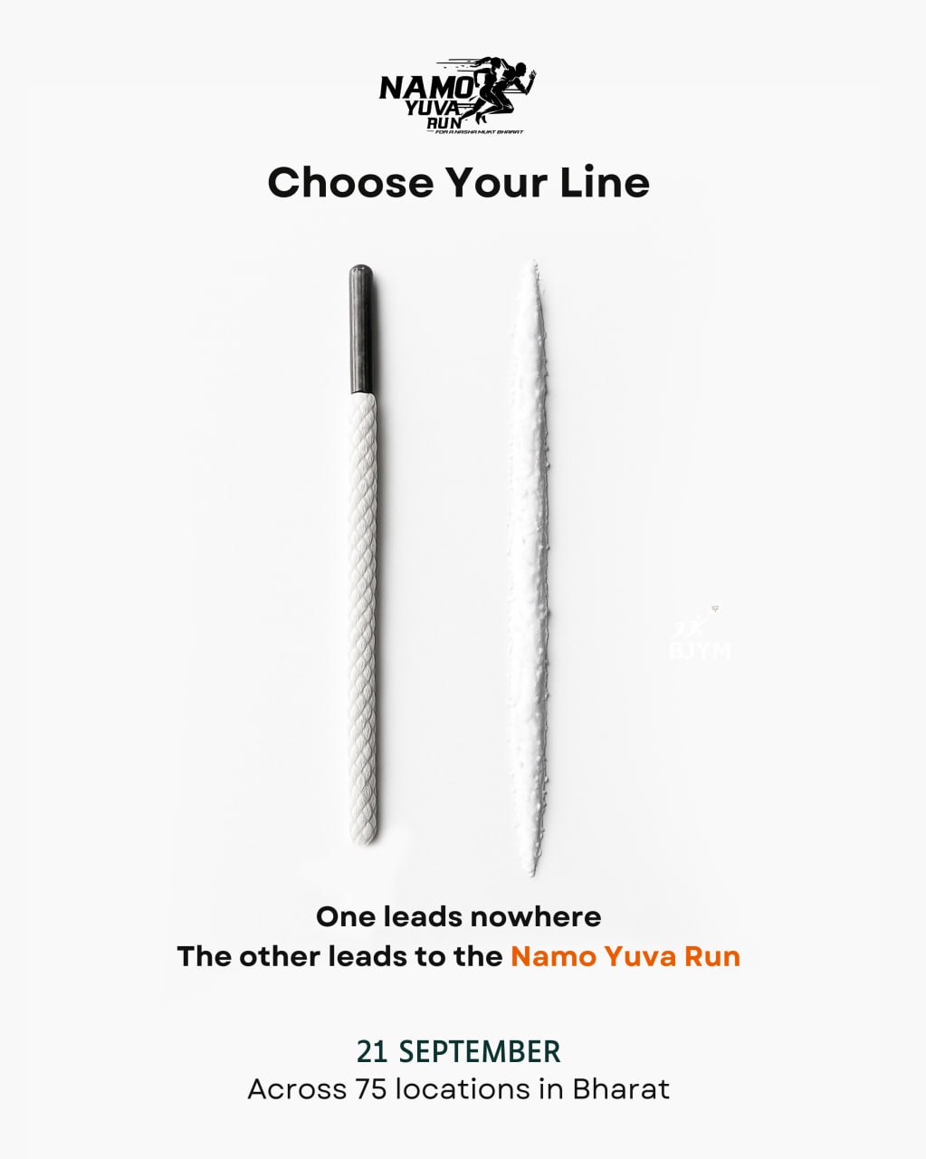

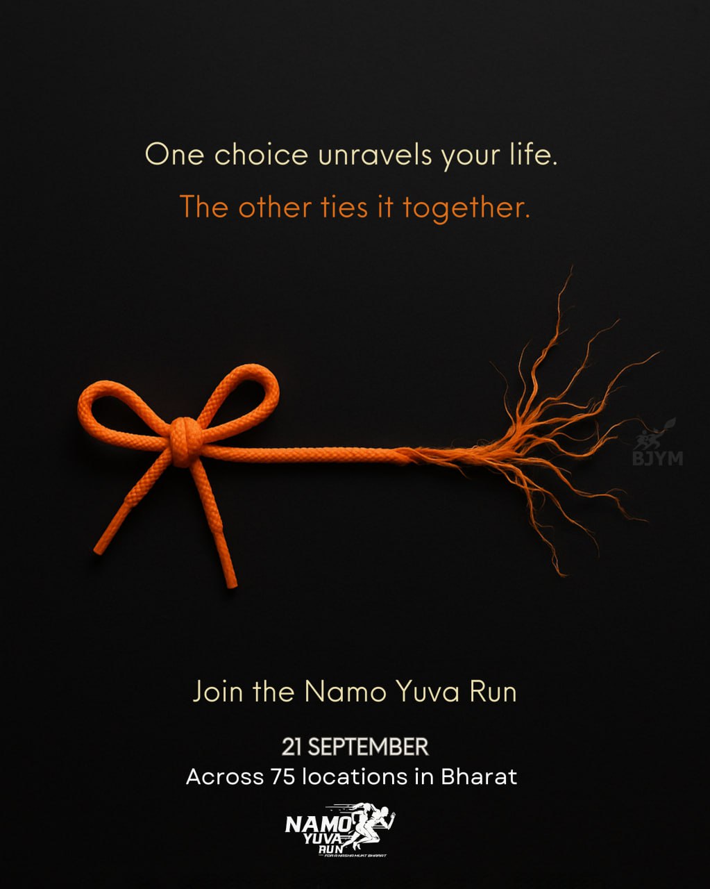
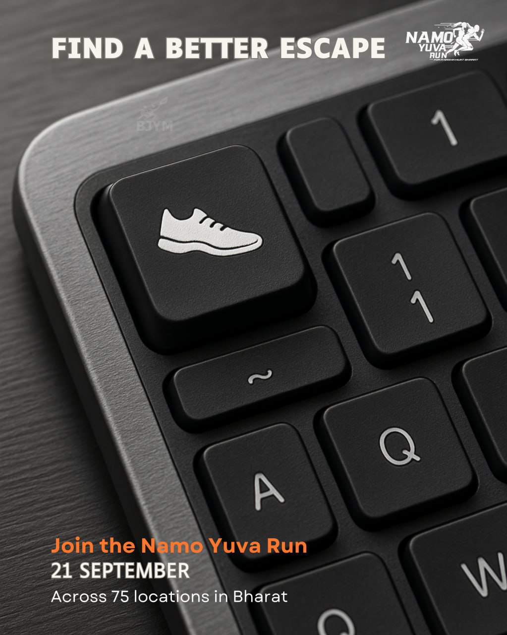
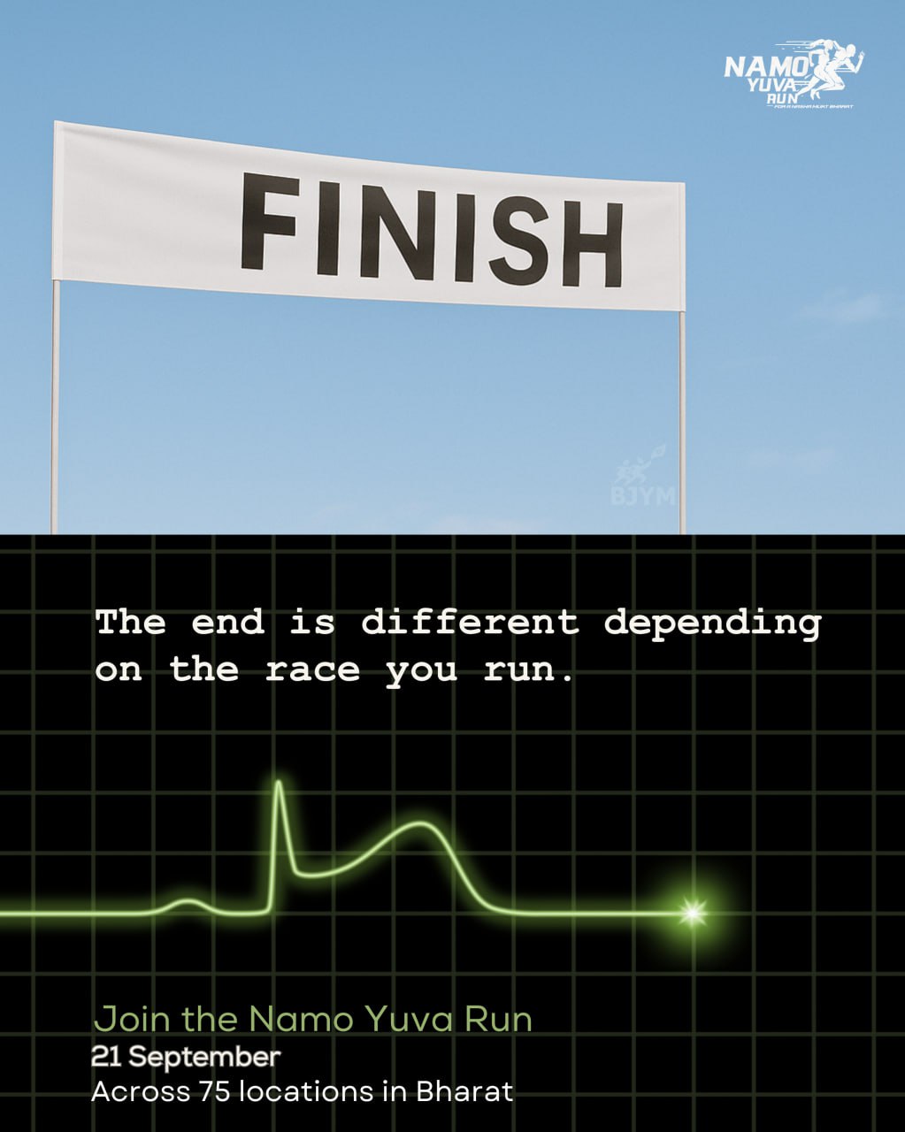
To reach a generation, borrow the language it already loves — Gully Boy, Pushpa, Mirzapur — each reframed into the run's one message.
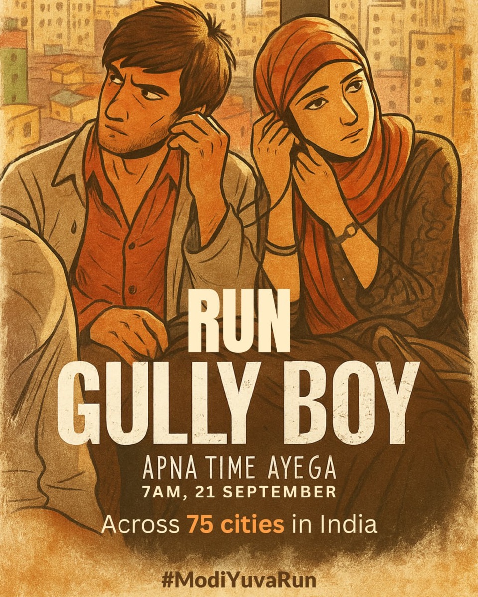
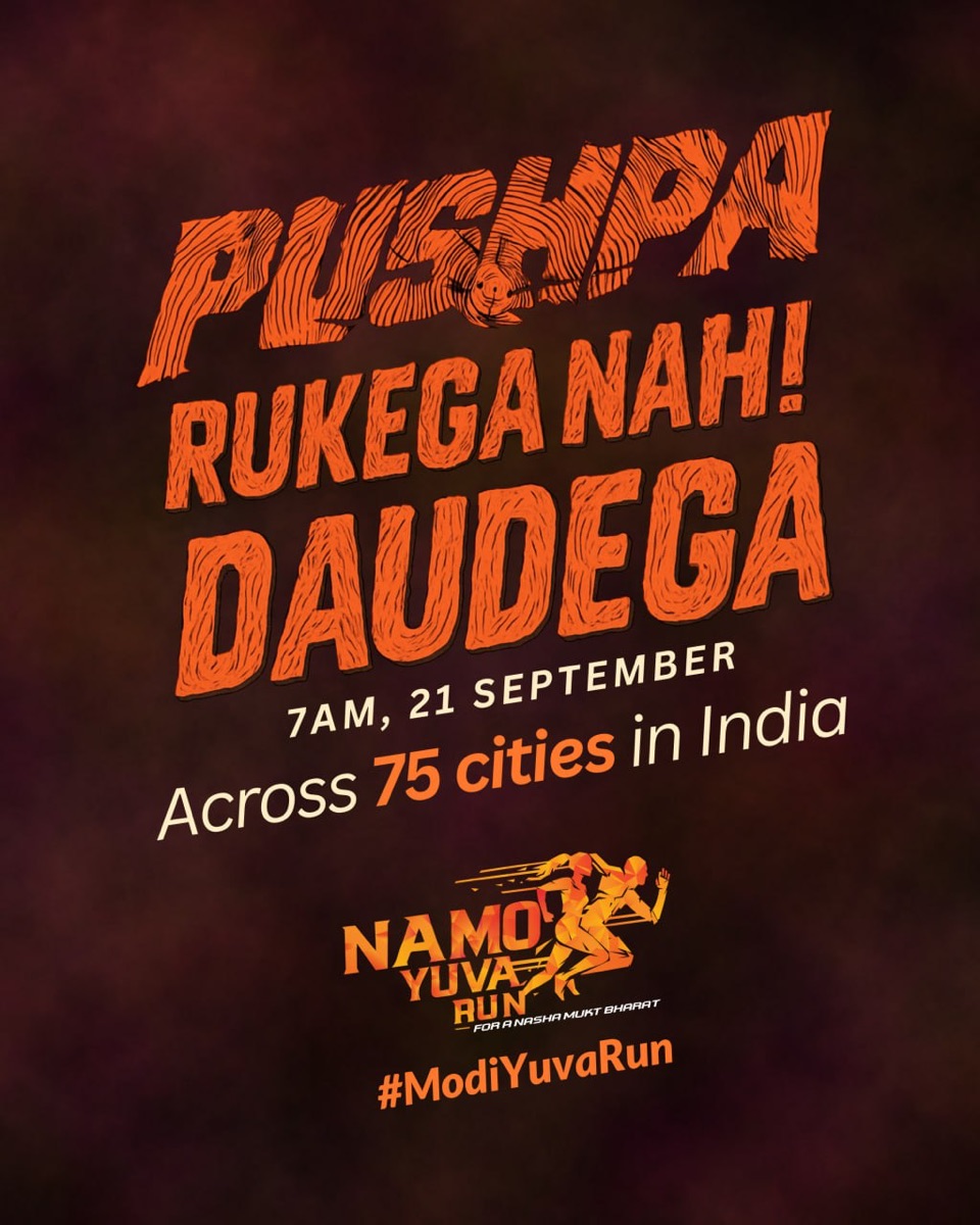
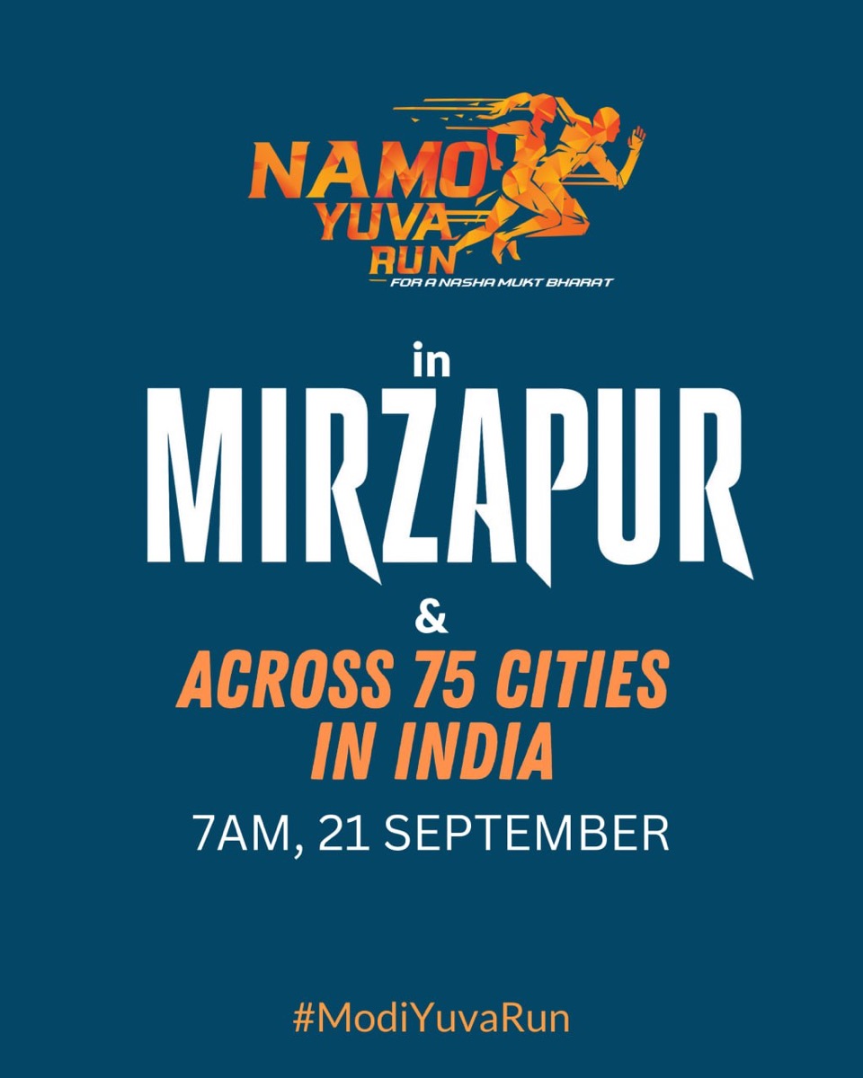
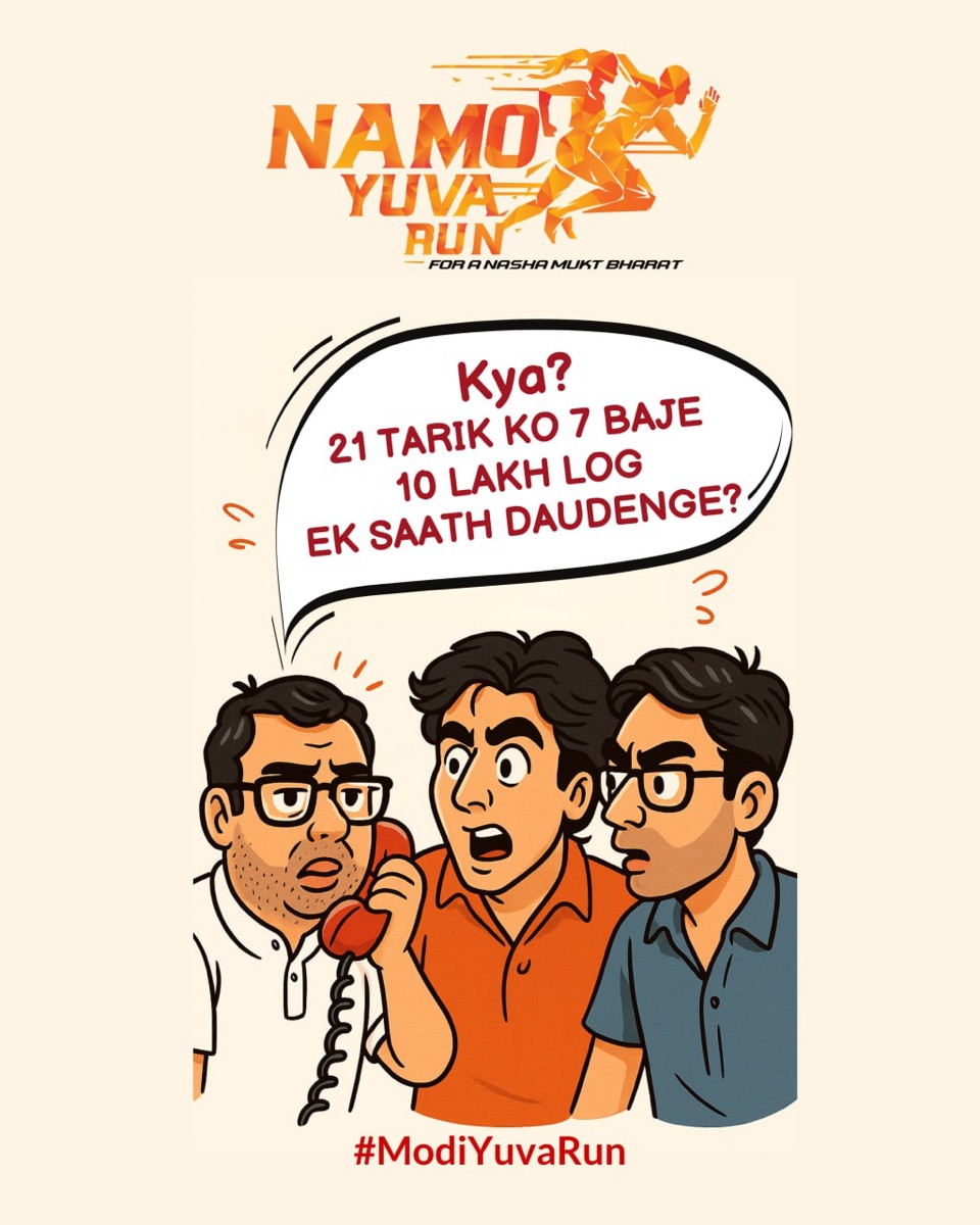
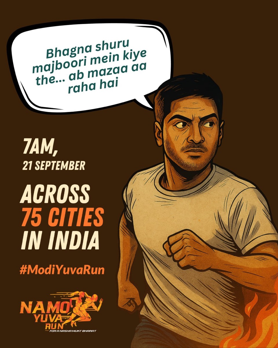
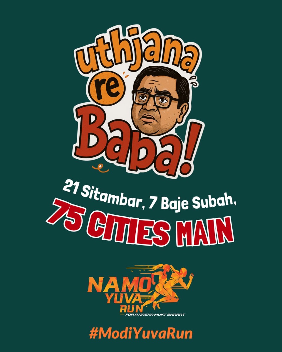
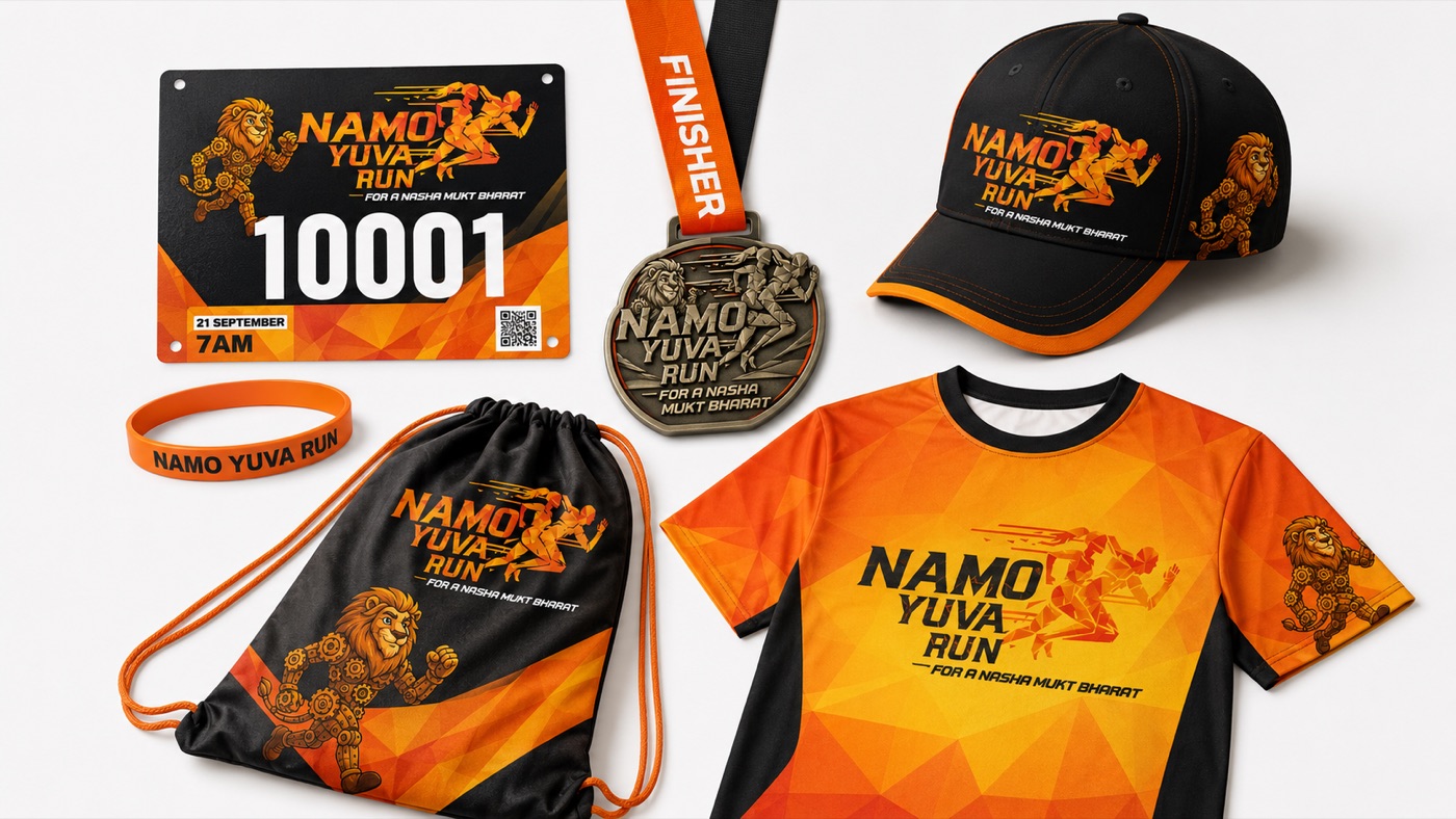
From the starting-line manifesto to the mascot — the assets that carried the run into the open.
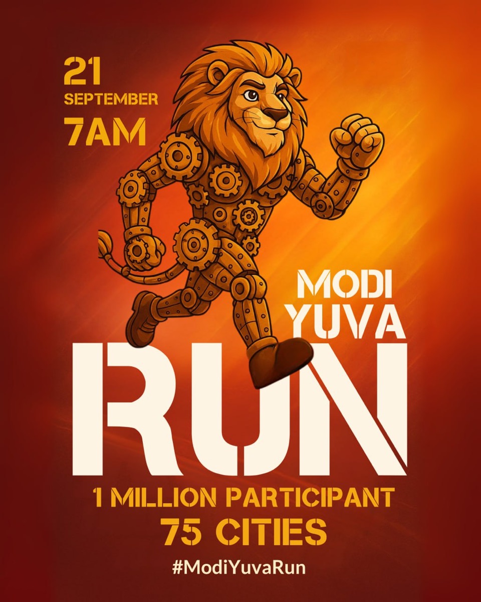
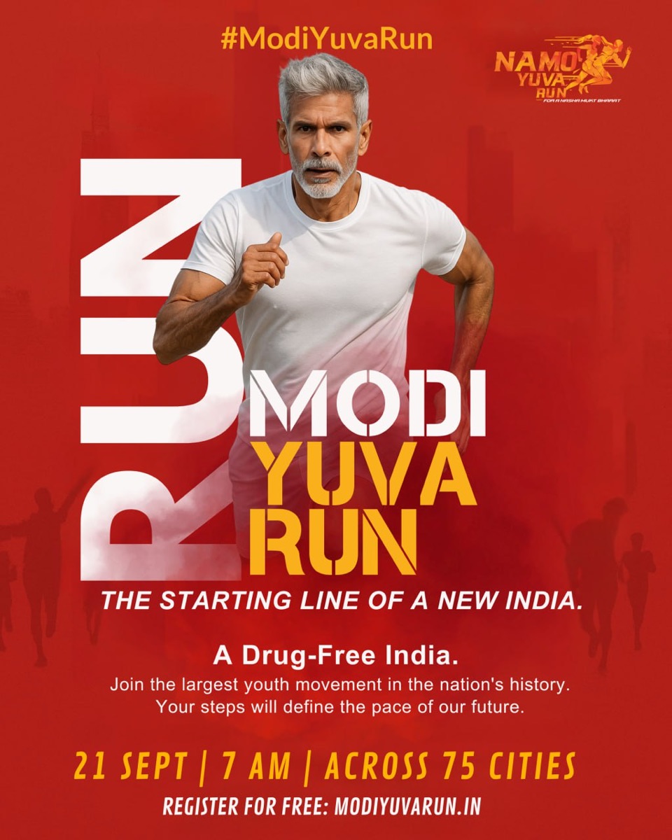
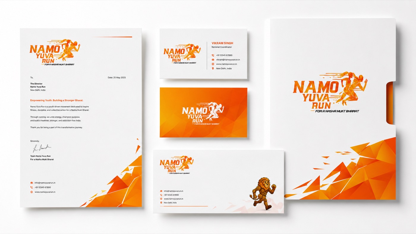
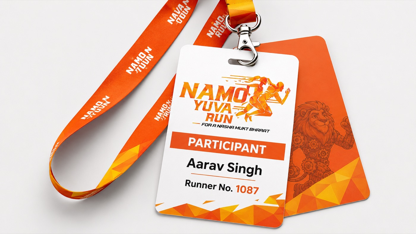
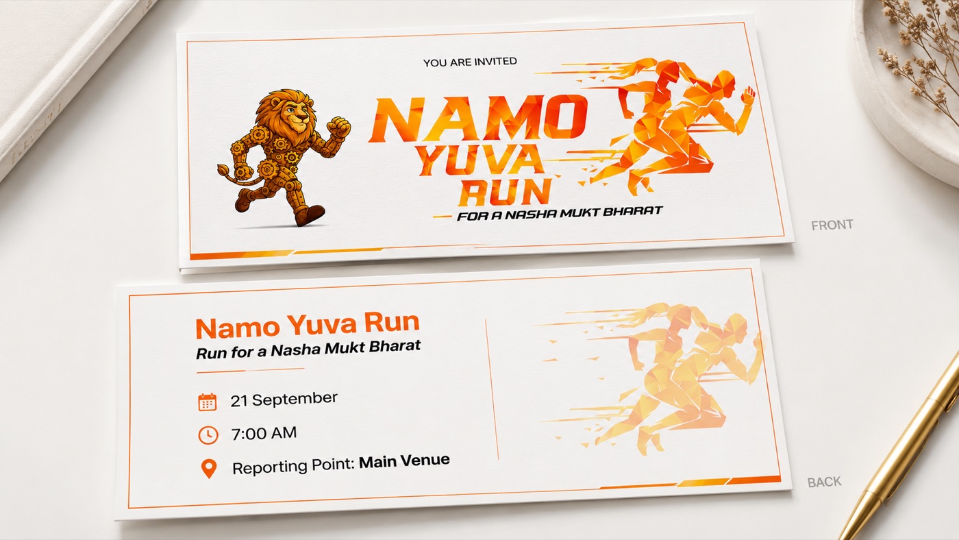
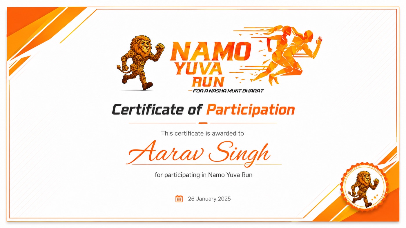
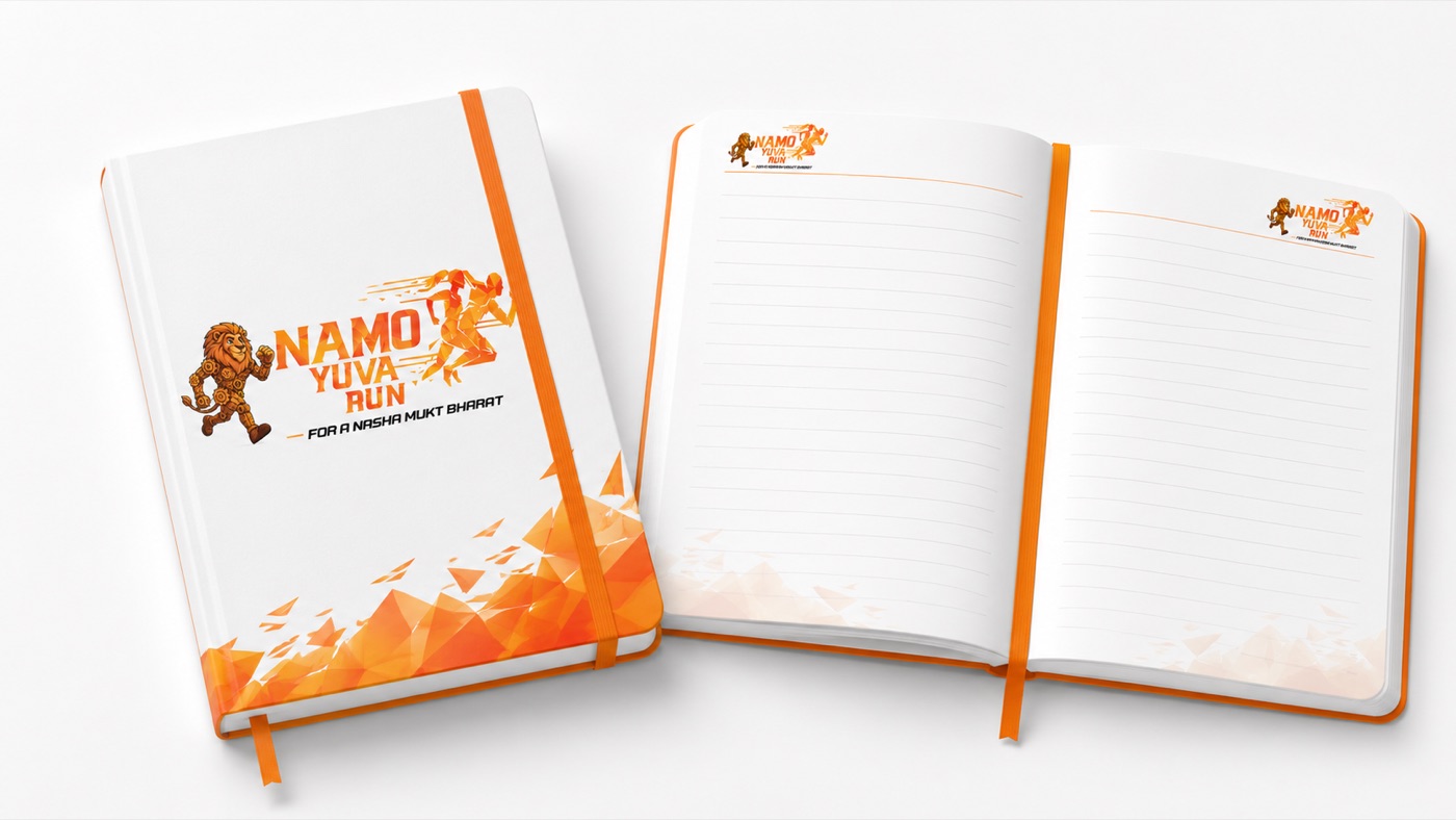
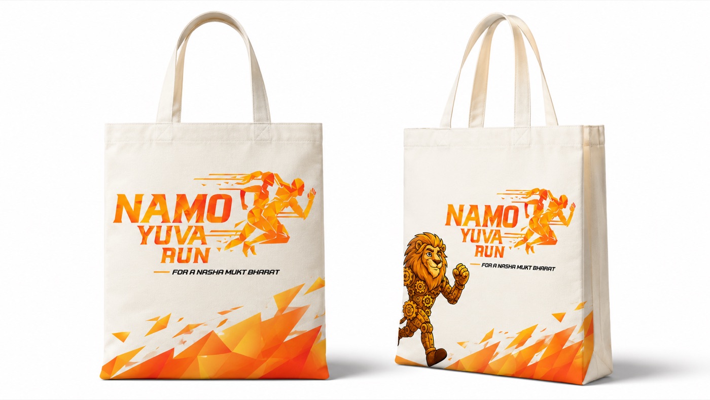
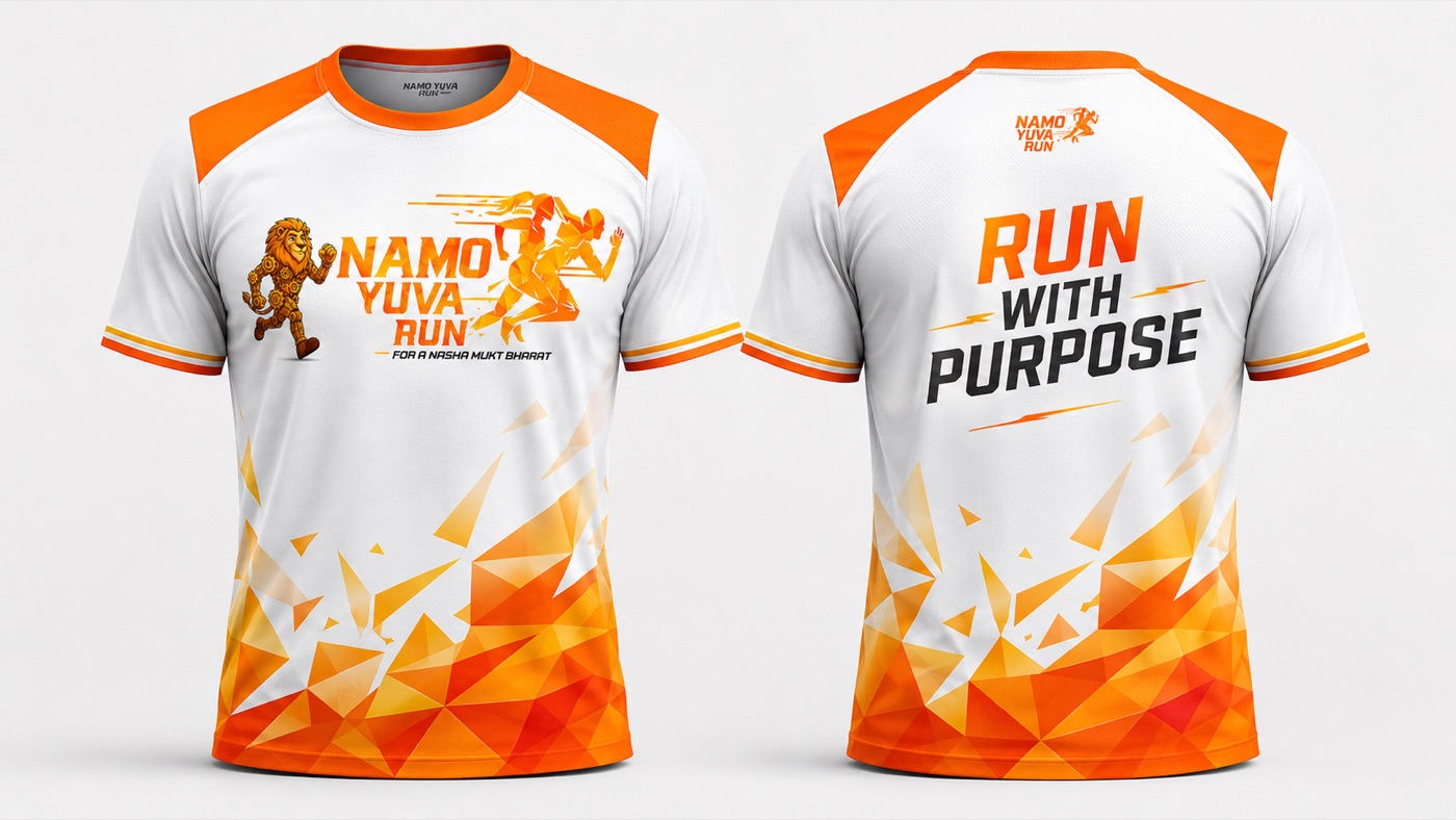
Behind the campaign sits a full event brand — a geometric runner in campaign saffron, a gear-built lion mascot, and a system that carries both from the start line to the certificate.
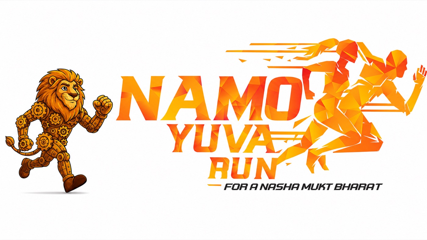
The mark and the mascot — a runner cut from energy, and the gear-built lion that leads it
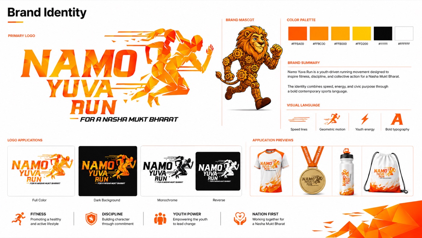
The identity system — saffron-to-gold palette, logo versions, mascot and visual language
Race day, built in the identity
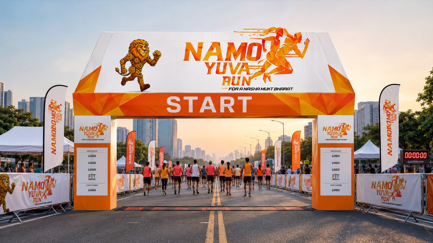
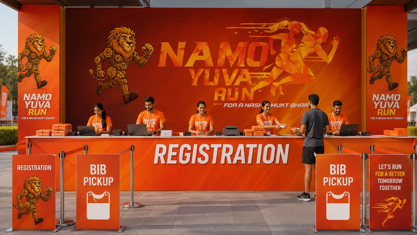
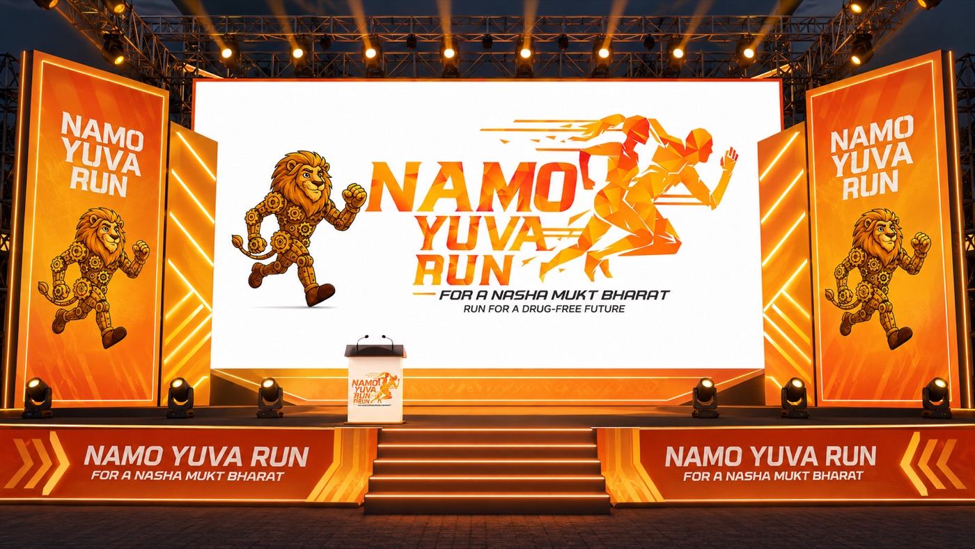
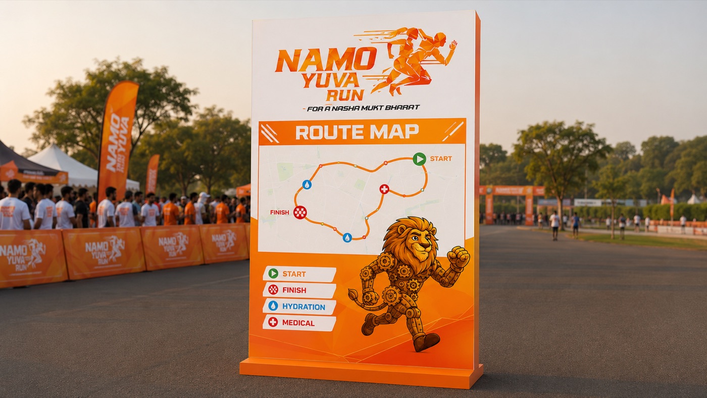
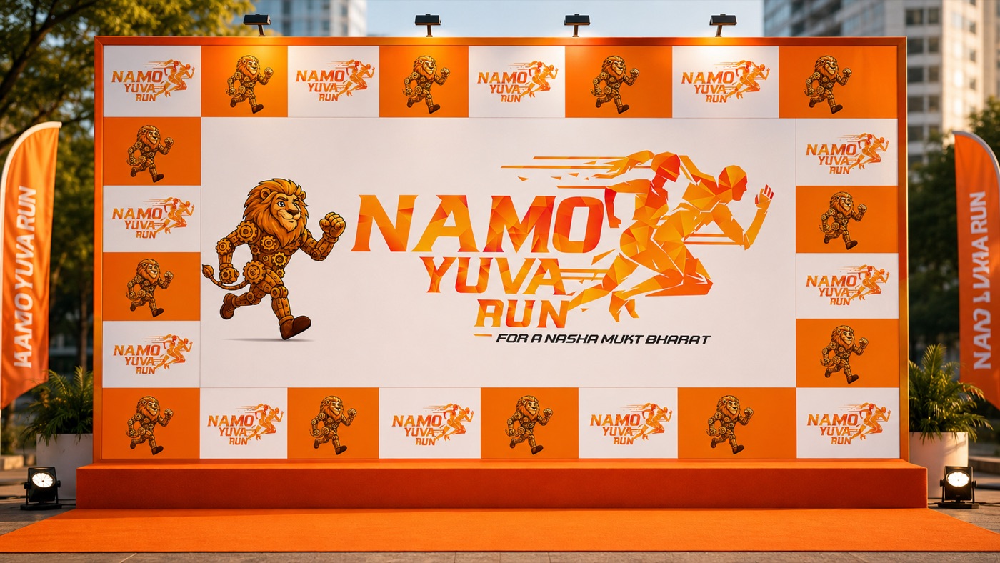
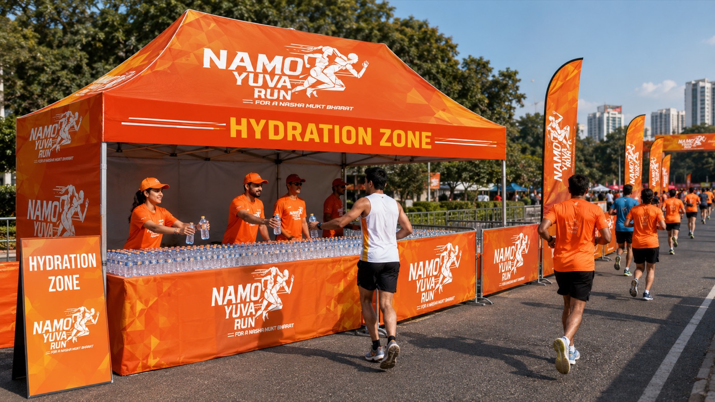
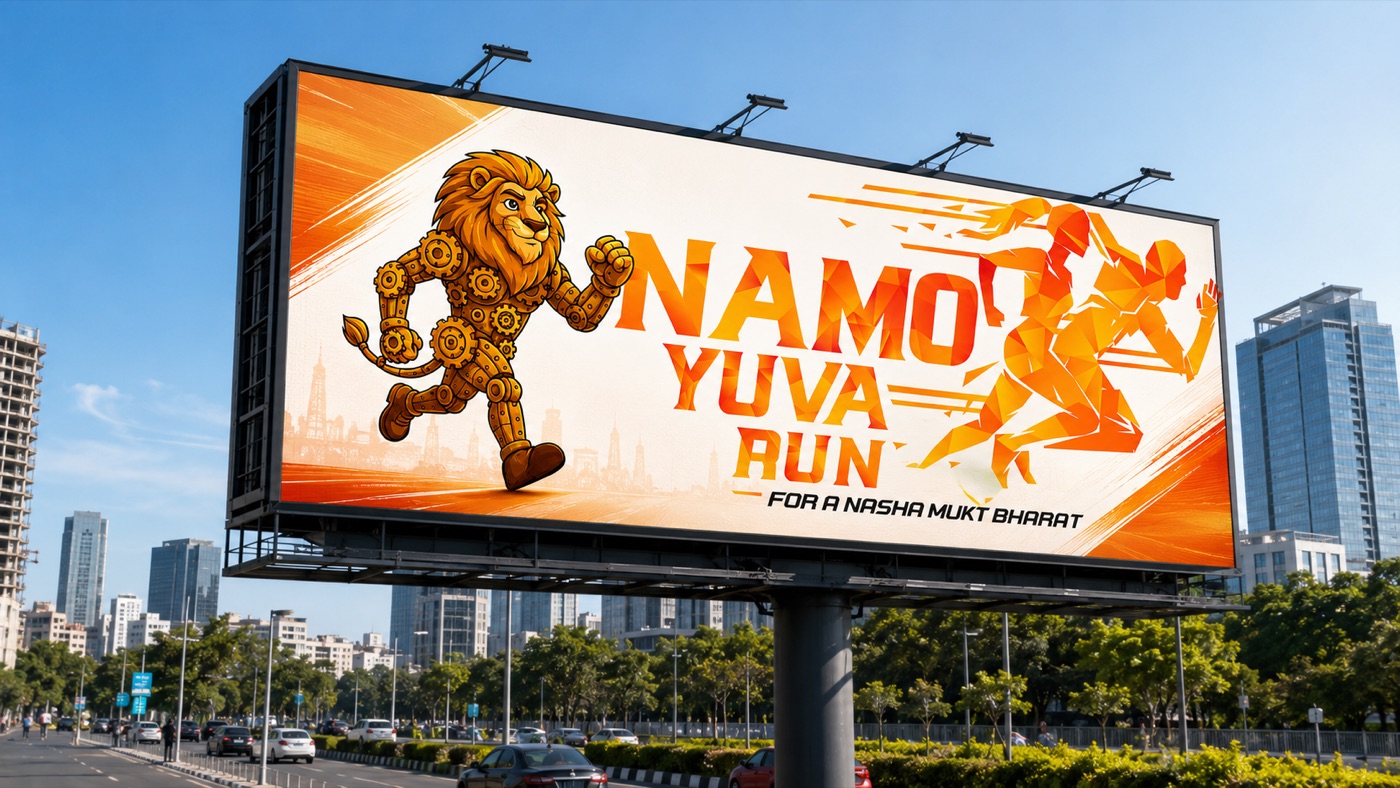
One system on every surface a runner touches — from the invitation to the finisher's certificate. Tap to enlarge.
Two reveal films cut for the campaign's digital push — the teaser that builds the mood, and the mascot charge that starts the run. Press play.
"A nationwide youth mobilisation campaign that turned fitness, public participation and Nasha Mukt Bharat messaging into a high-energy political communication movement."
Strategic insight · 05Brand & Packaging · Wellness beverage
A kombucha and fermented-wellness brand, est. 2020 — "Nature's Always Right." One pine, five flavours and a complete commercial system: identity, packaging, café presence, retail display, delivery experience and digital storefront.
Kombucha reads as an acquired taste — a health fad in a crowded chiller.
A warm, natural brand world: identity, five-flavour packaging system and every surface from café table to inbox.
From a fermented drink to a daily wellness ritual.
The brand thought
Wellness brands usually argue with science. Go Grin persuades with warmth — a pine that promises nature, a palette that tastes like the flavour it carries, and a voice that says relax, refresh, revive.
Your daily dose of health — kombucha as an everyday ritual, not an experiment.
Forest green plus five flavour hues — Tangy Turmeric to Pineapple Passion — across labels, cartons and displays.
Brand identity, packaging system, retail and café POSM, delivery experience, merchandise and digital marketing kit.
Bottle, chiller, café counter, courier box, feed and inbox — one language everywhere.

The mark — one pine, est. 2020
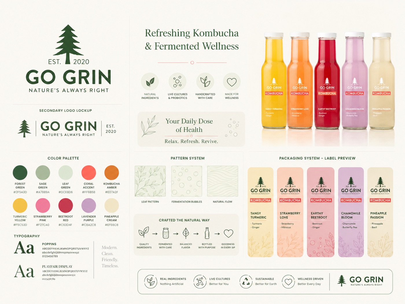
The identity system — forest green, five flavour hues, leaf & fermentation patterns, Poppins × Playfair
The brand, on shelf and in hand
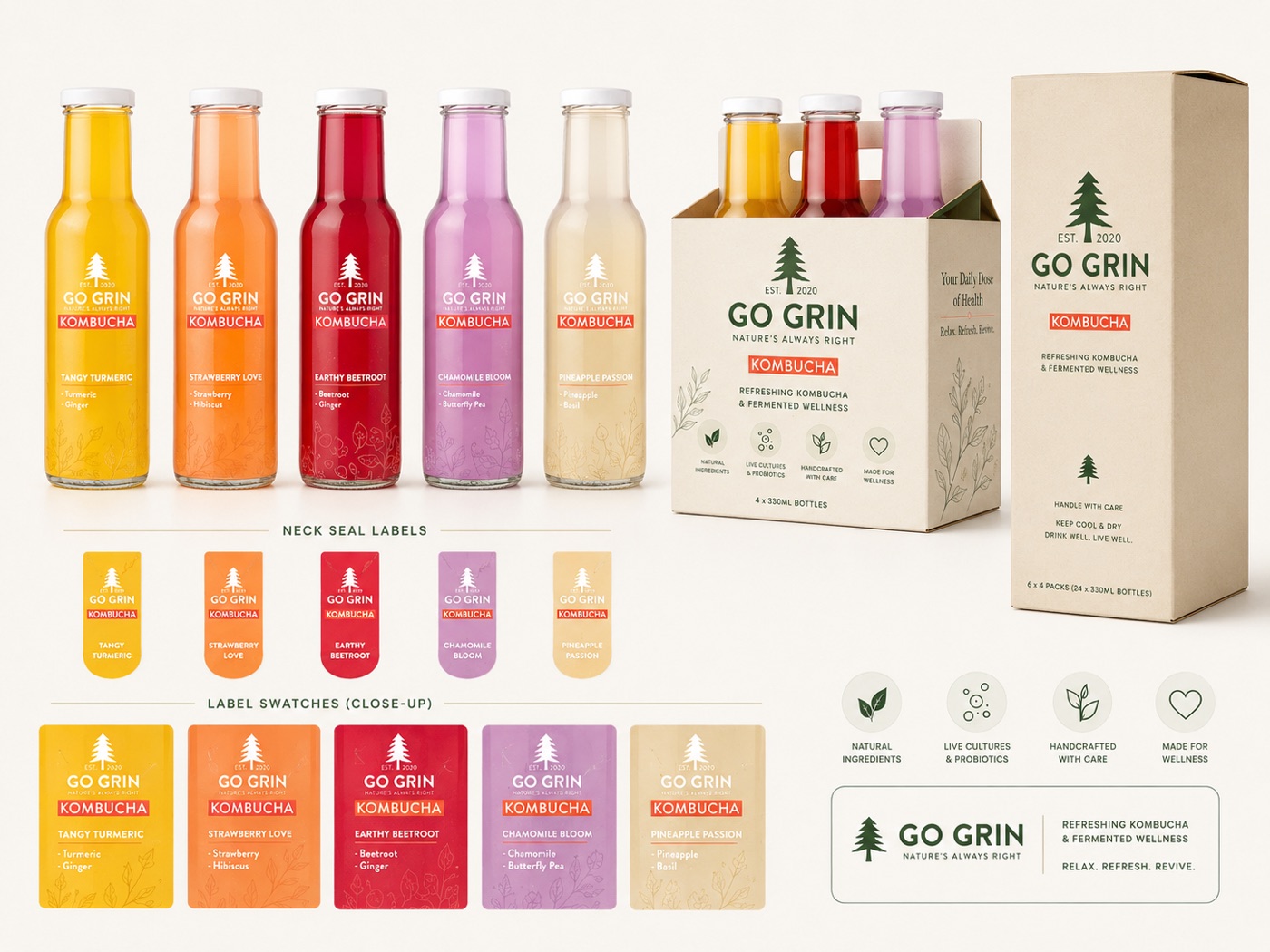
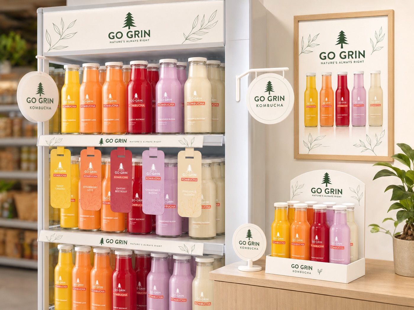
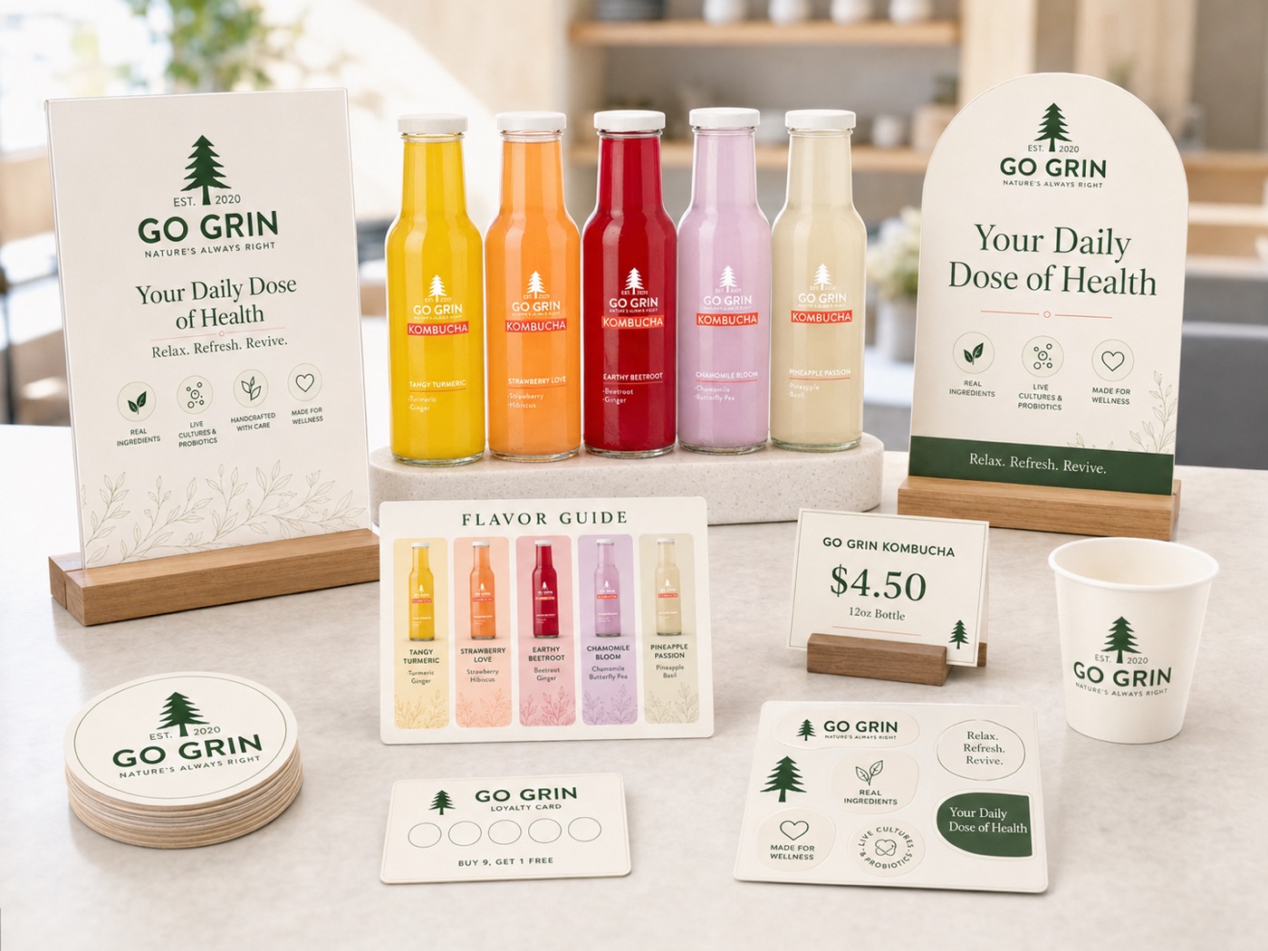
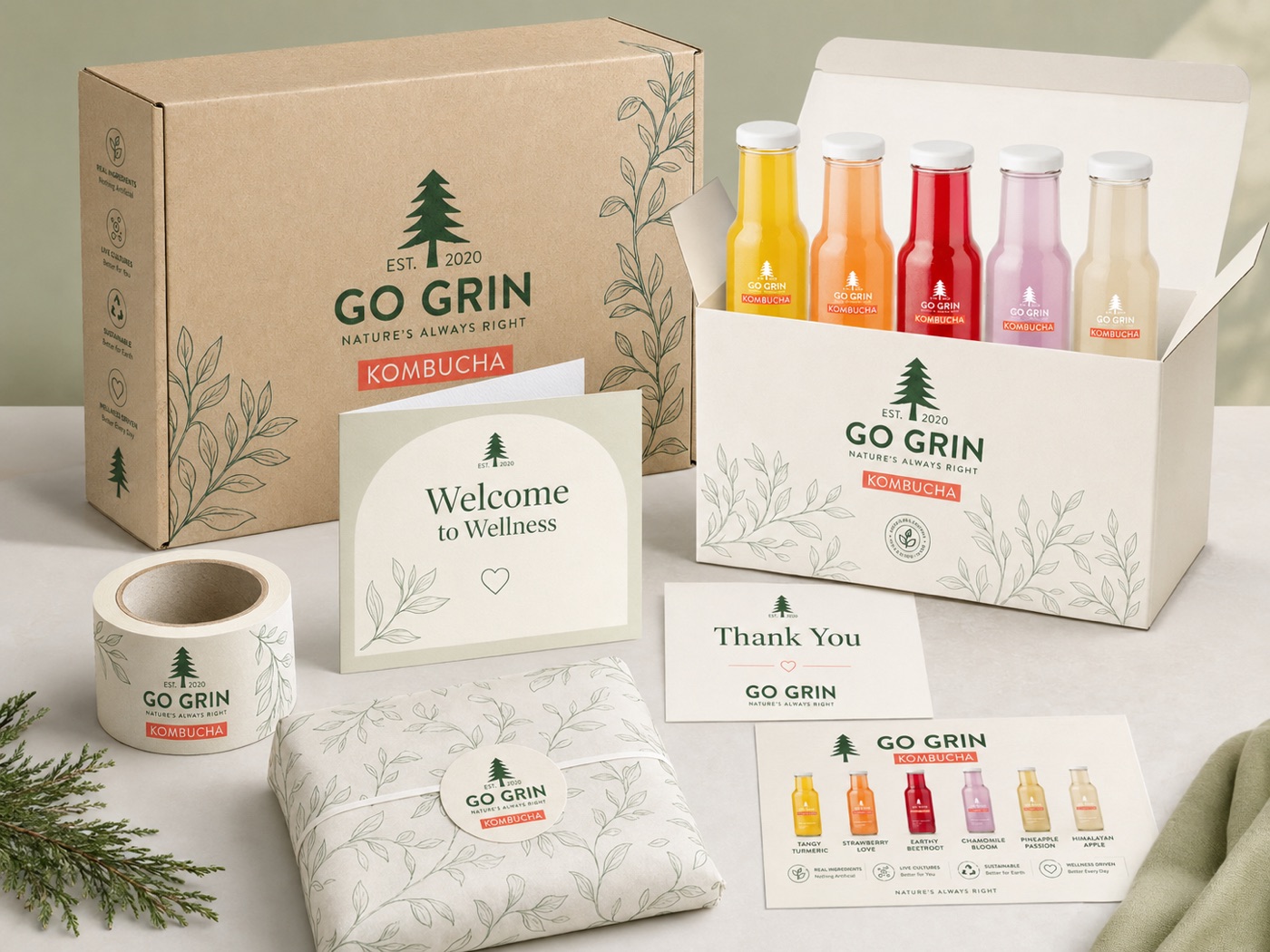
The same calm system at business, merchandise and digital scale. Tap to enlarge.
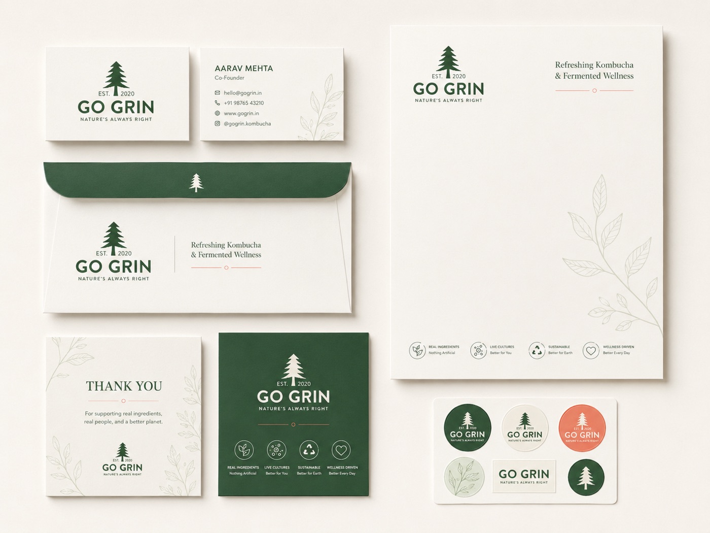
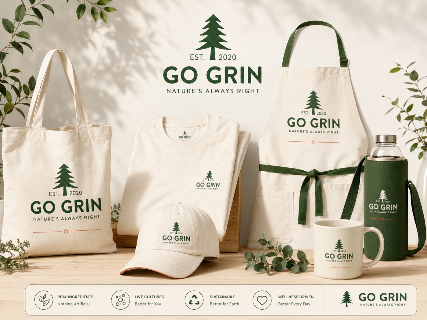
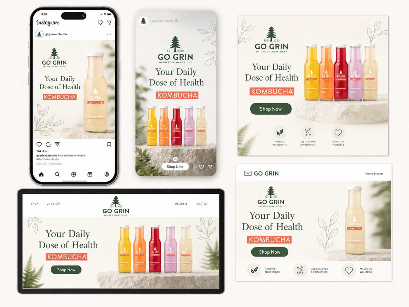
"Health is an argument. A grin is a feeling. The brand was built so the healthier choice would also feel like the friendlier one."
Strategic insight · 06Anya Segen

